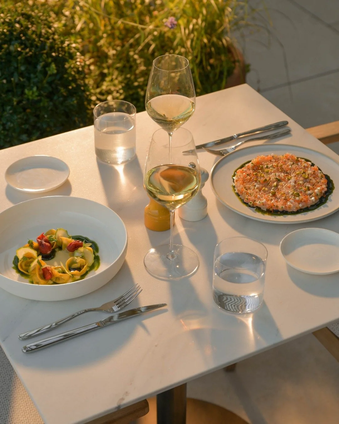
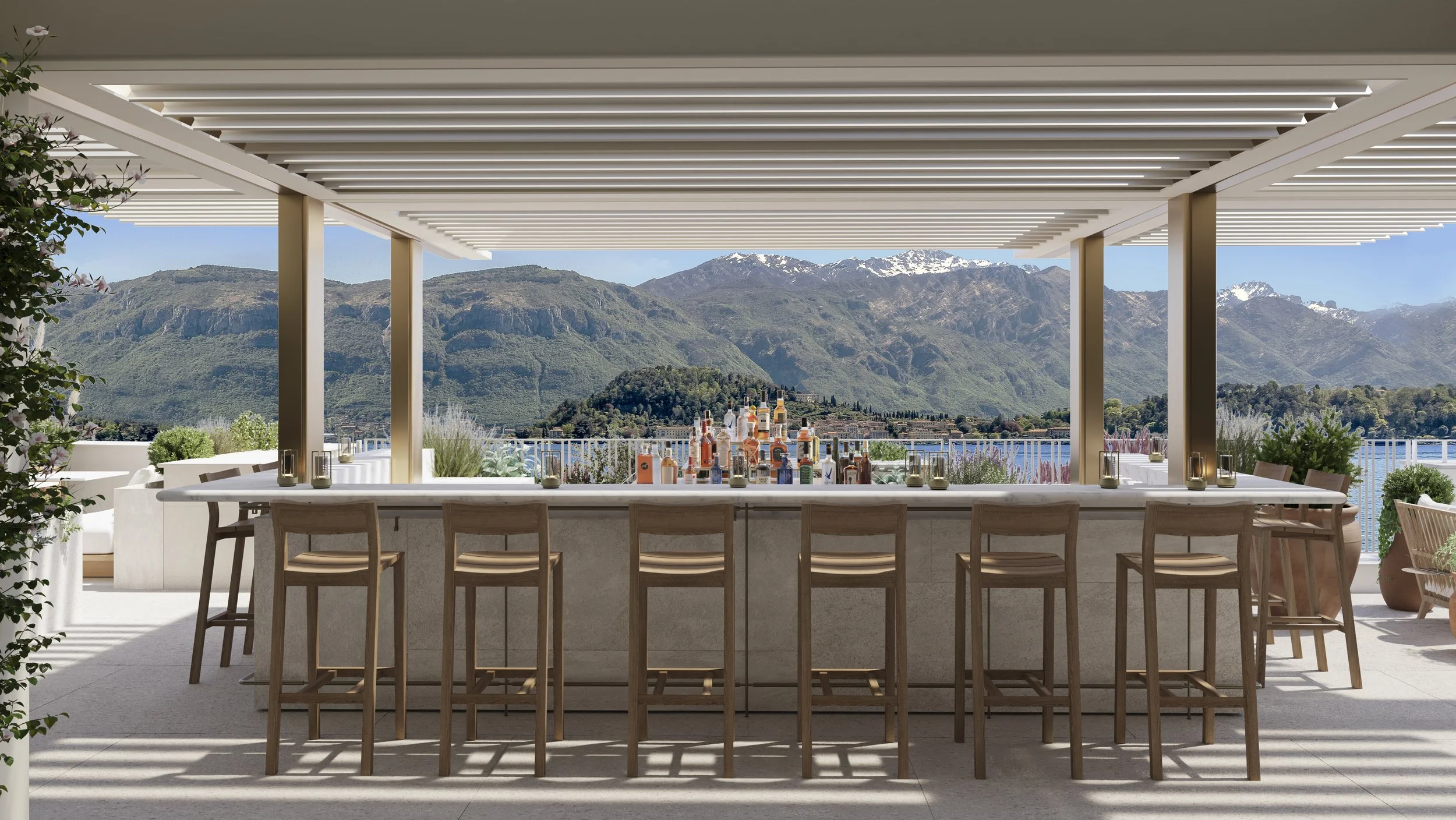
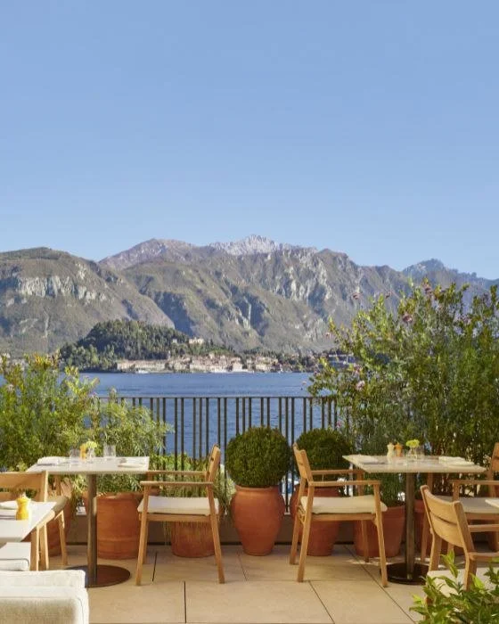
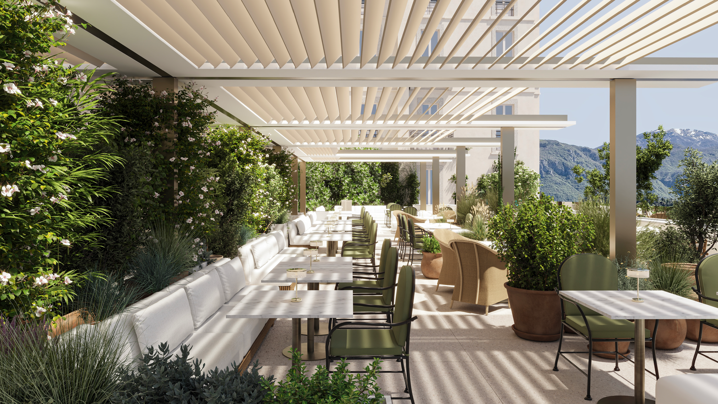
Renzo is an all-day dining destination overlooking Lake Como and the Bellagio mountains, conceived as a place to gather, linger, and enjoy shared moments from morning through evening. Rooted in a romantic spirit, the concept balances effortless hospitality with a sense of warmth, ease, and timeless appeal.
I led the visual identity from concept through execution, working closely with the chef partner and F&B team to translate their vision into a cohesive brand system. The process began with logo exploration, eventually landing on a fluid wordmark that balances classic structure with expressive movement. Careful attention was given to proportion, rhythm, and tone to ensure the identity felt personal and inviting rather than formal.
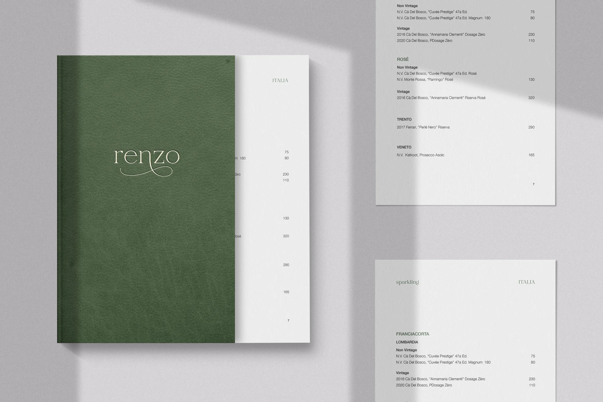
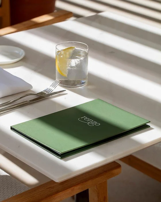
The resulting system was applied across menus and branded guest touchpoints, designed to feel cinematic yet approachable and deeply connected to its setting. Each element supports the experience of lingering, conversation, and shared dining, reinforcing Renzo as a place shaped by atmosphere, intention, and place.
Renzo
Brand Strategy, Art Direction, Logo Design, Visual Identity, Menu Design, Print Collateral, Guest Touchpoints
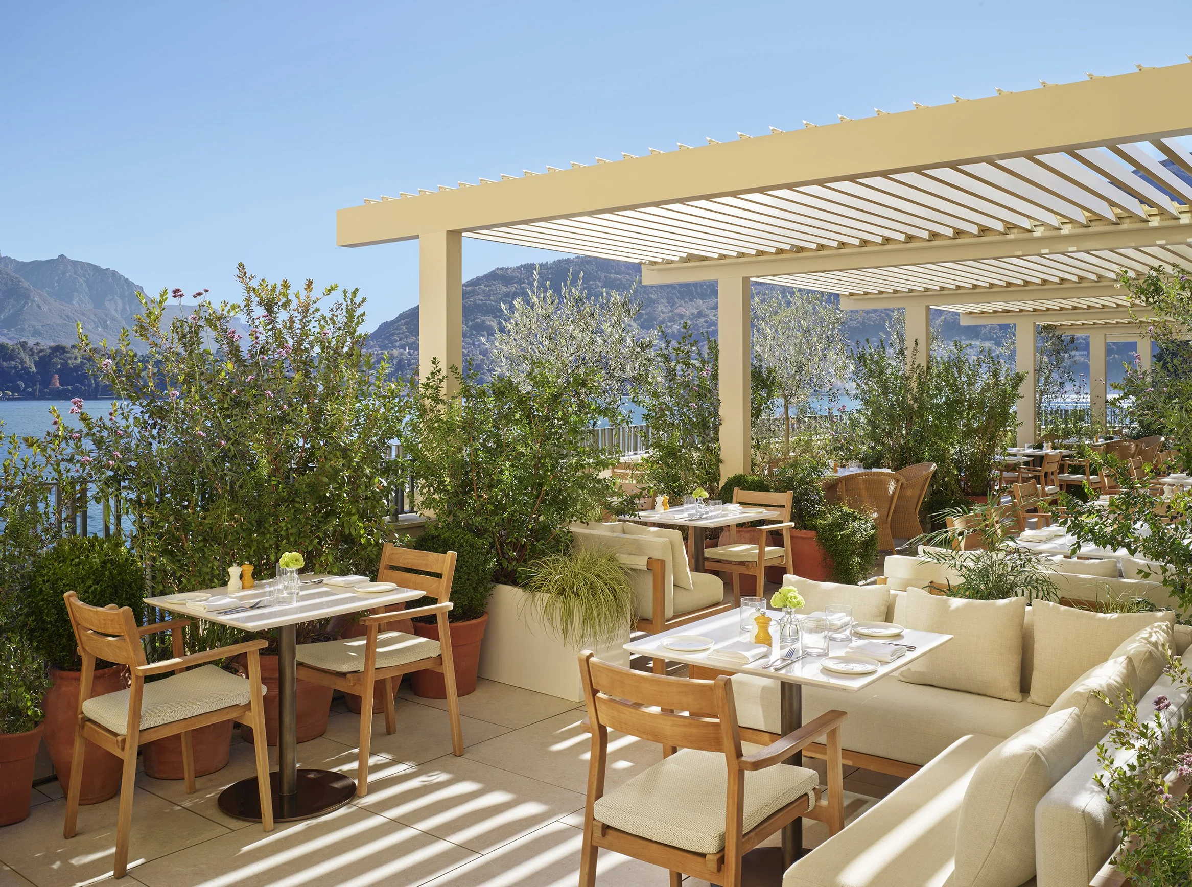
The chef partner and F&B team envisioned Renzo as an all-day dining destination overlooking Lake Como and the Bellagio mountains, defined by a romantic, social spirit and designed for lingering from morning to night.
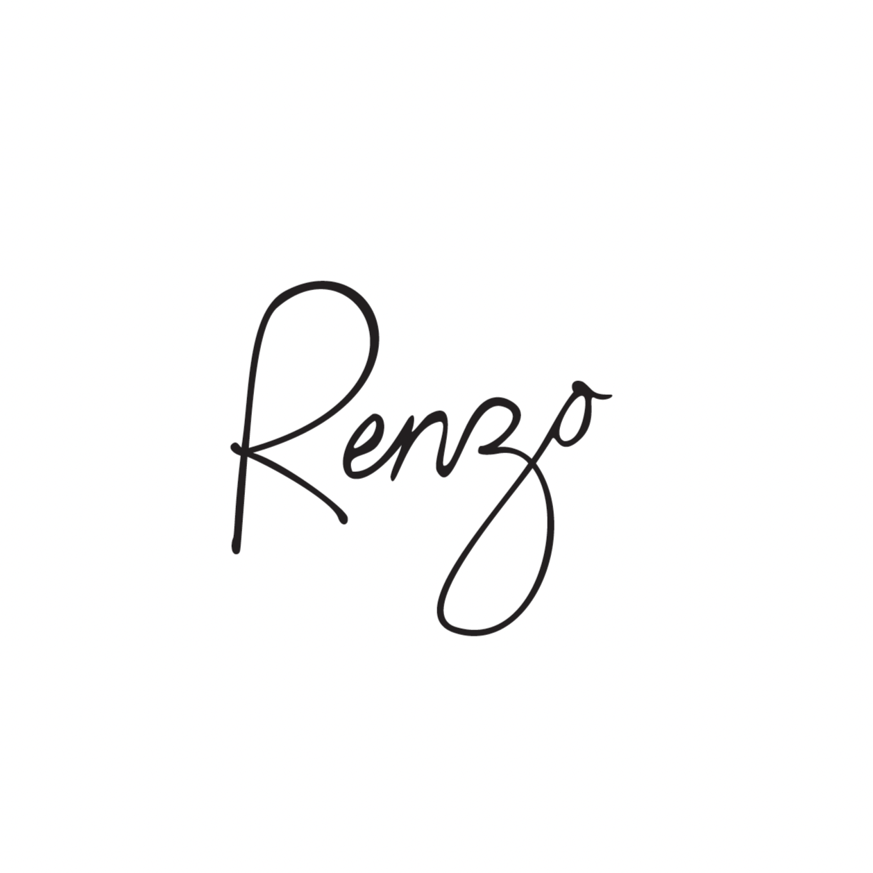
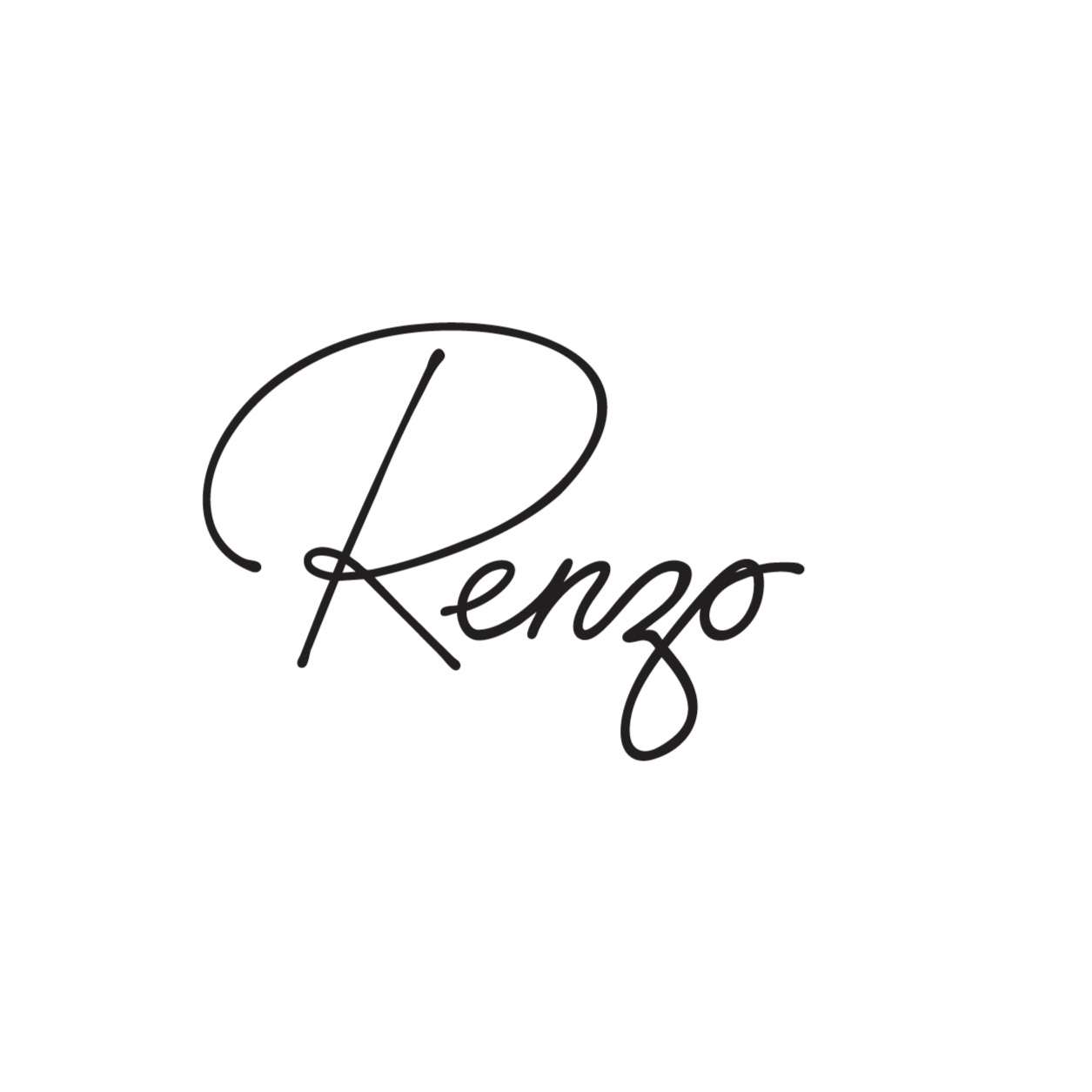
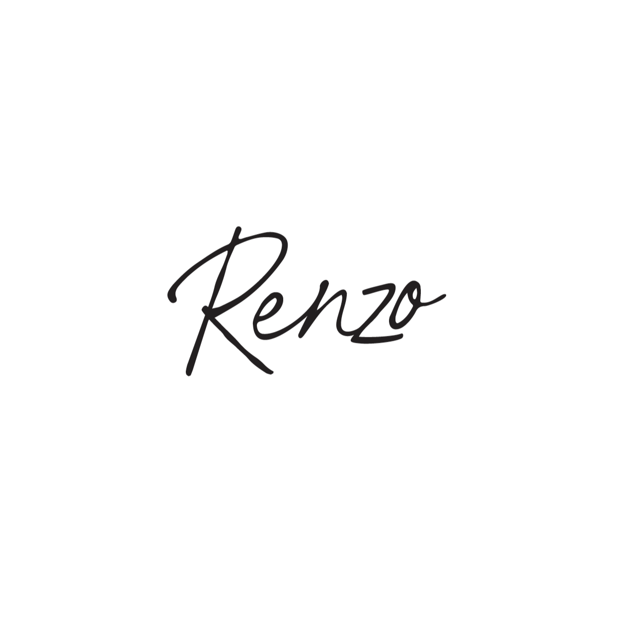
Using this vision as a foundation, I developed the initial logo explorations, drawing inspiration from the Romeo-like origin of the name. The first directions focused on handwritten, expressive marks that felt personal and inviting, as if Renzo were signing his name.
To balance this warmth, I introduced a more cinematic, refined logo option that captured the timeless elegance of Lake Como. Together, these explorations established a flexible identity that reflects Renzo’s romance, ease, and sense of place.
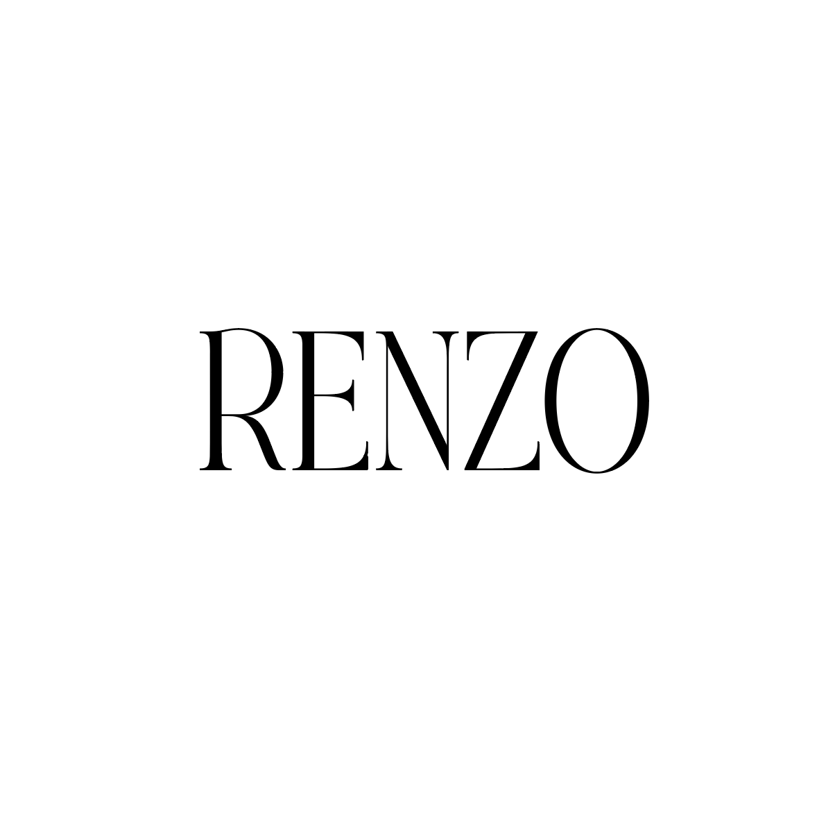
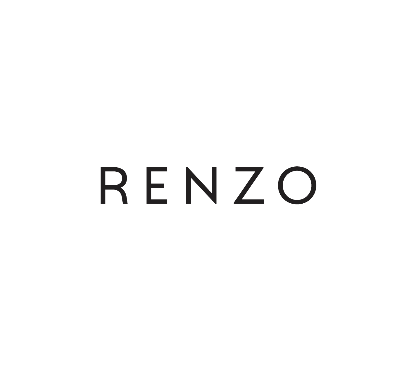
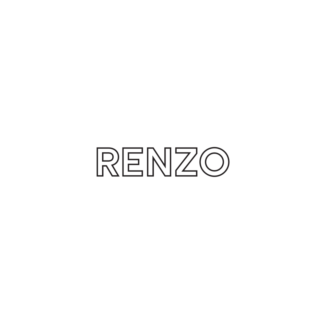
After presenting the initial logo explorations, the chef partner and F&B team responded strongly to a direction that felt more classic while still maintaining a sense of youth and romance. In response, I introduced four refined logo options that evolved the identity toward a more timeless expression without losing its warmth or approachability.
These logos focus on clean typography and subtle detailing, allowing the name Renzo to feel confident, cinematic, and enduring. Each option balances classic elegance with a relaxed, modern sensibility, inspired by the atmosphere of Lake Como and designed to work seamlessly across day-to-night touchpoints. Together, they represent a thoughtful progression of the brand, shaping Renzo as a place for gathering, lingering, and shared moments around the table.
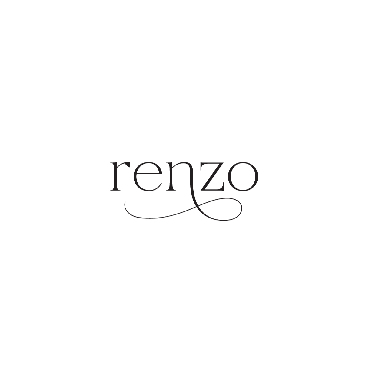

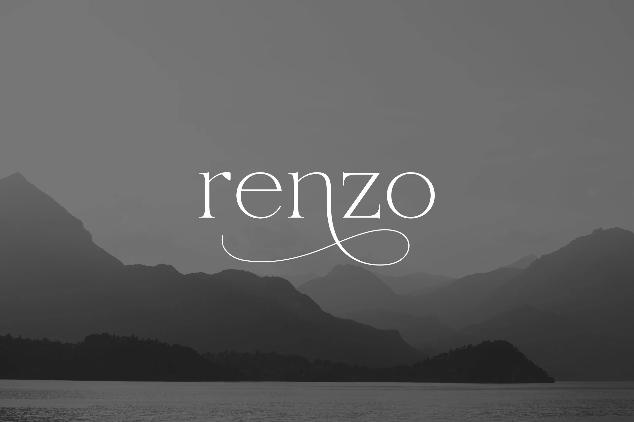
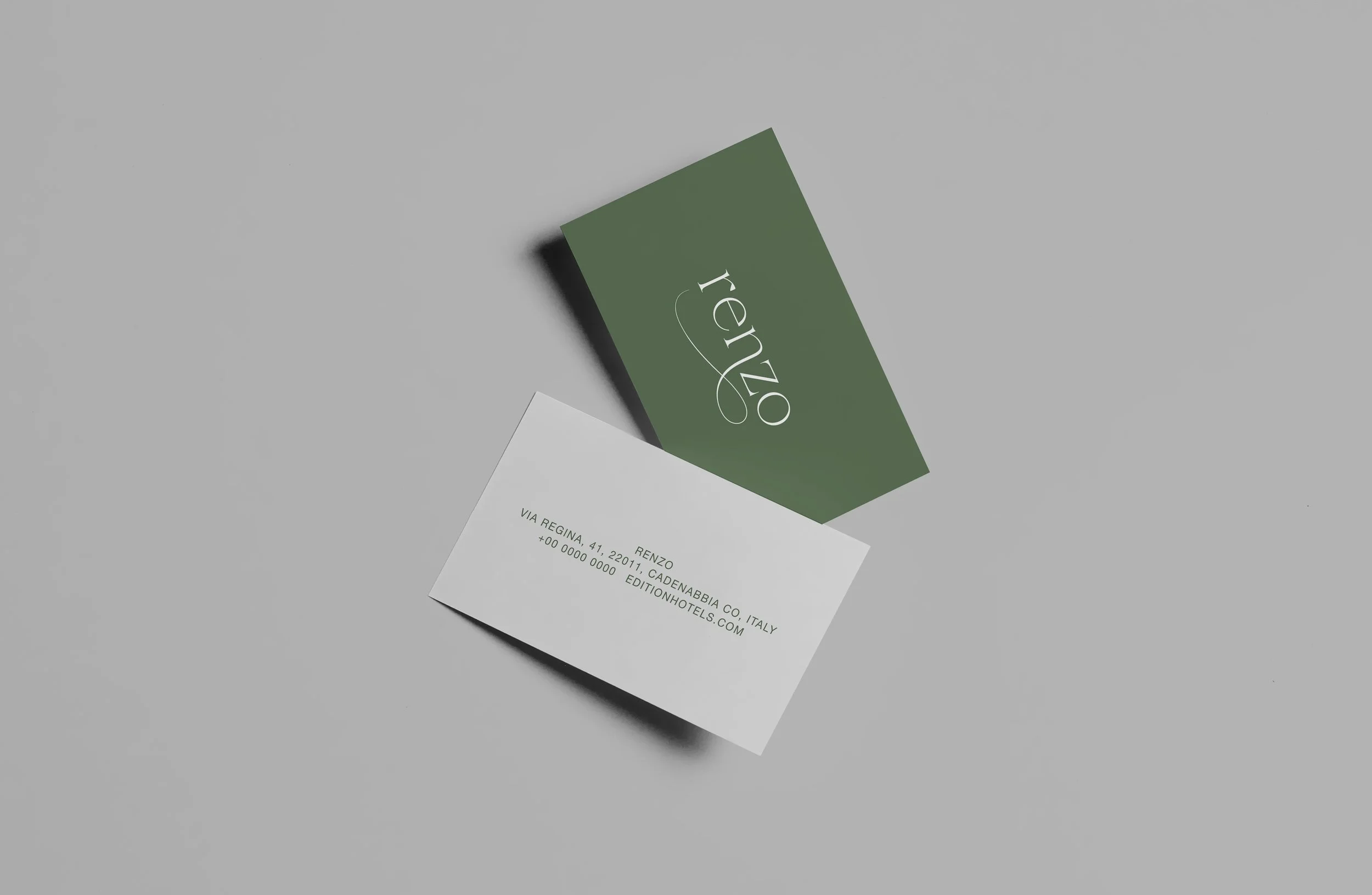
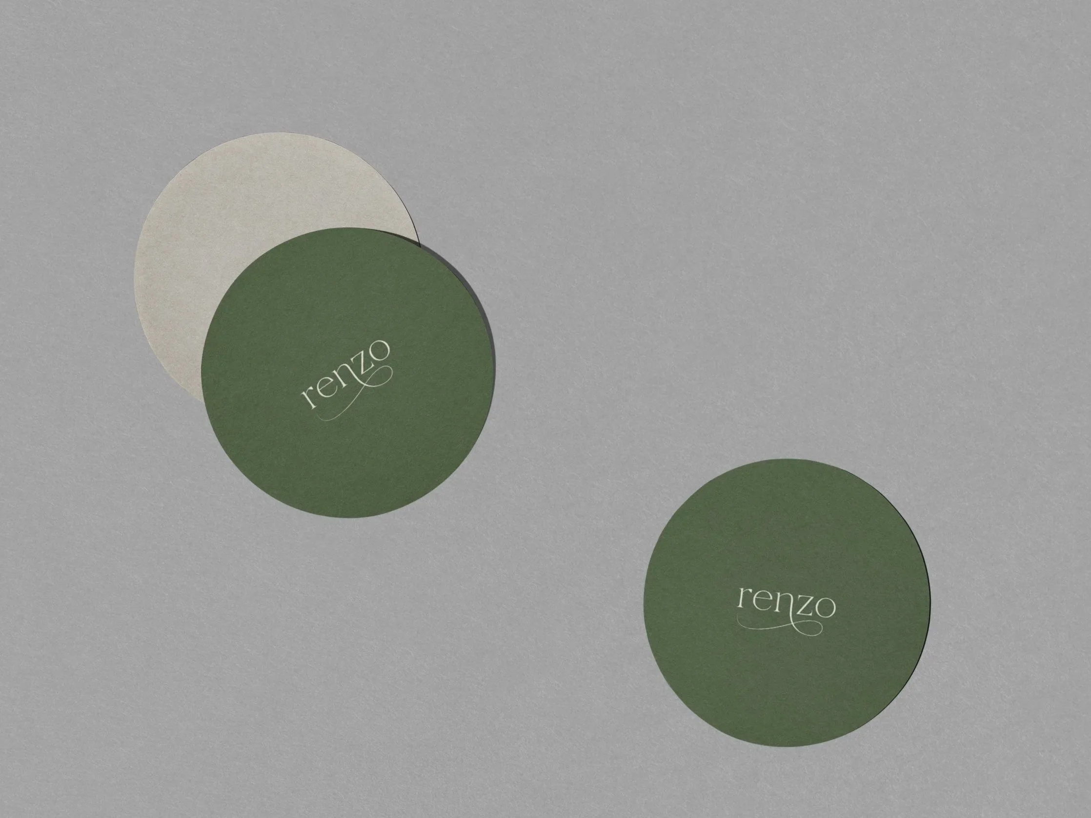
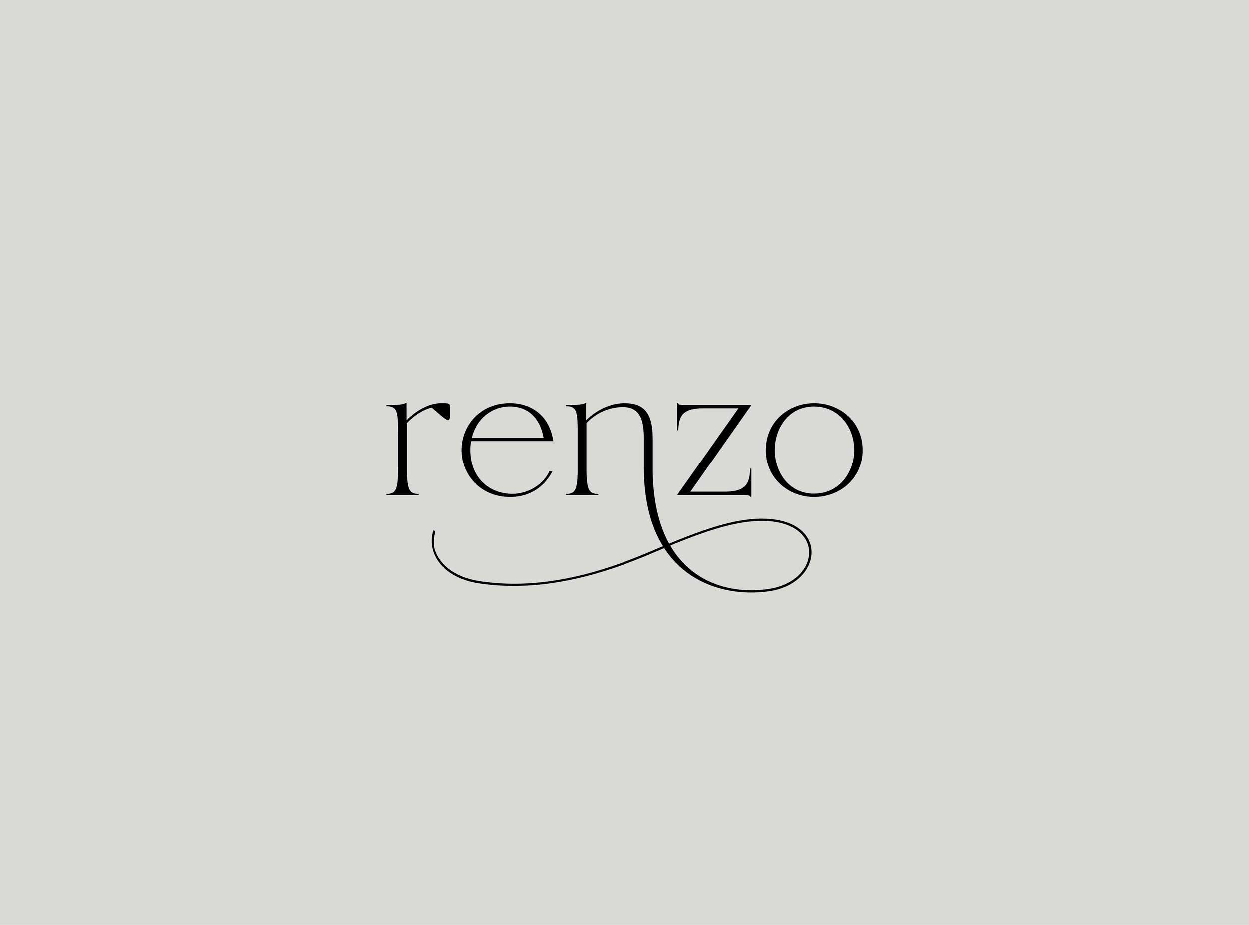
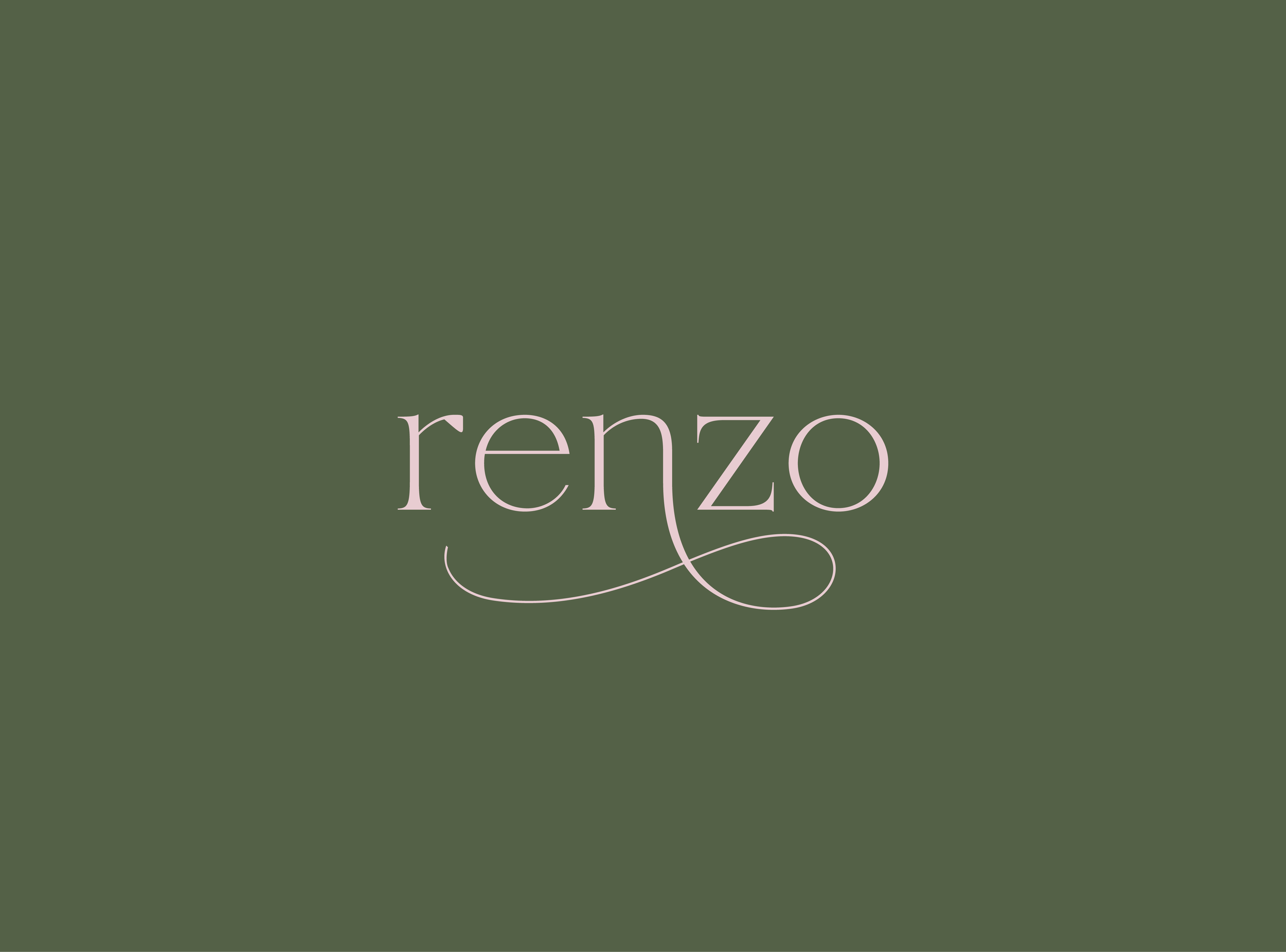
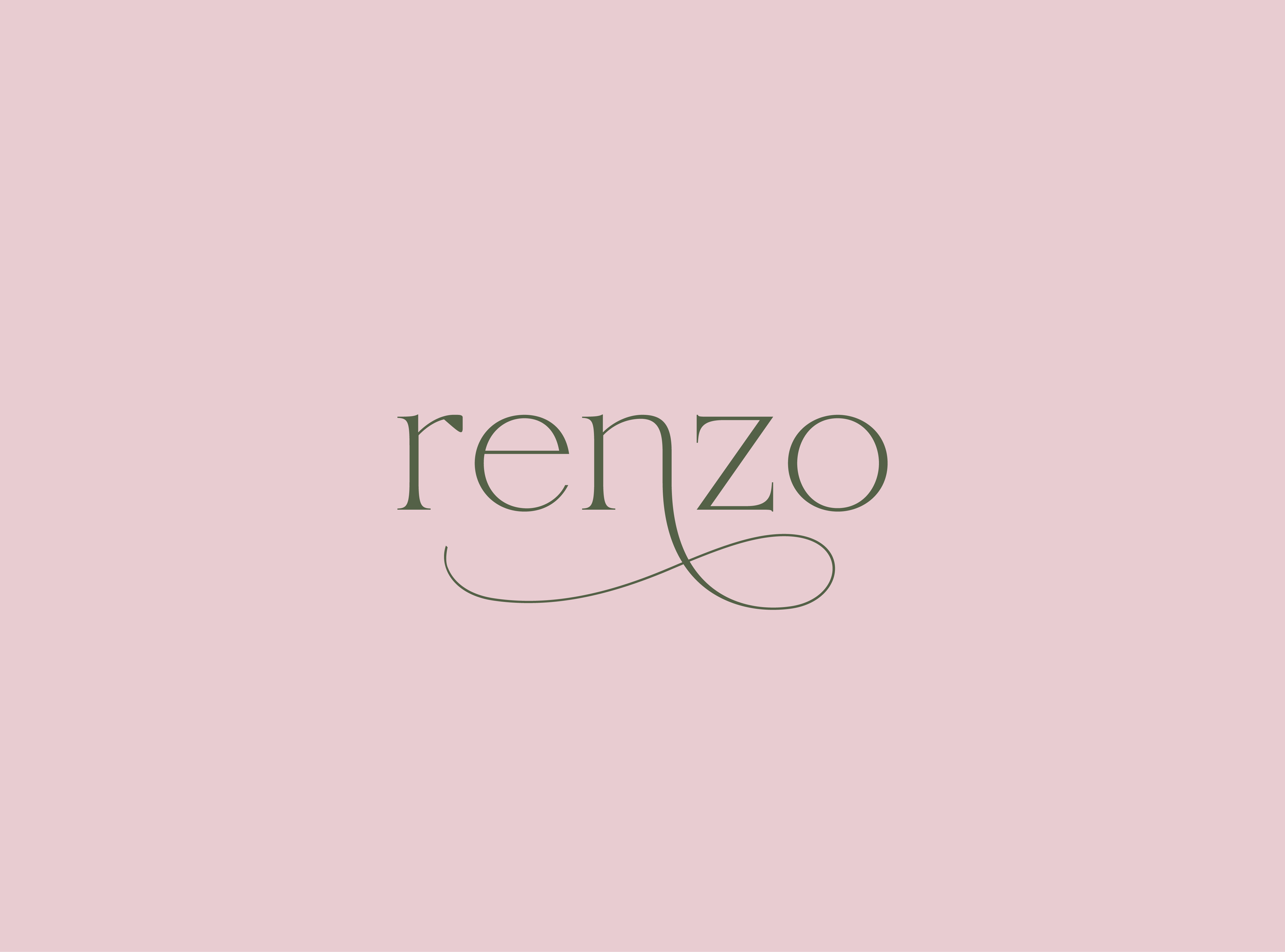
The final selected logo was this fluid wordmark, chosen for its balance of classic structure and romantic expression. The movement of the n creates a signature-like gesture, giving the mark a sense of personality and ease while still feeling cinematic and timeless. Its flow allows the logo to live comfortably across day-to-night moments, reflecting Renzo’s all-day dining experience.
With the form established, the focus shifted to refining the color palette, ensuring the logo’s emotion and sense of place were fully realized through tone and atmosphere.
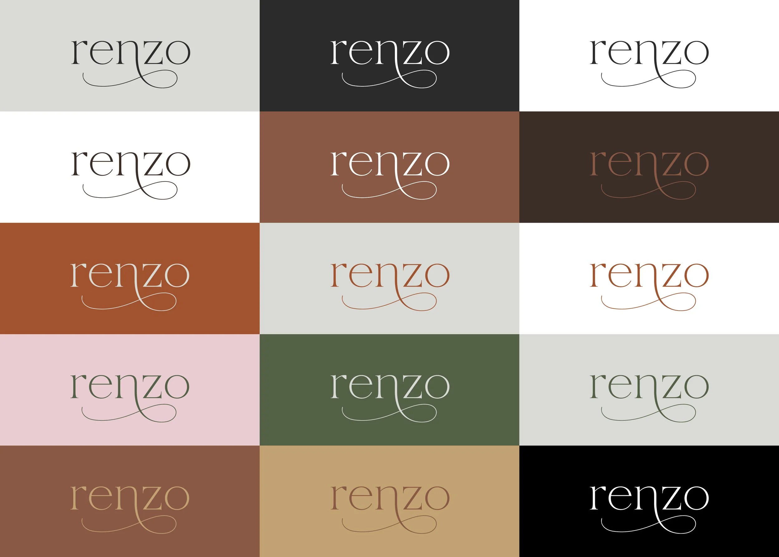
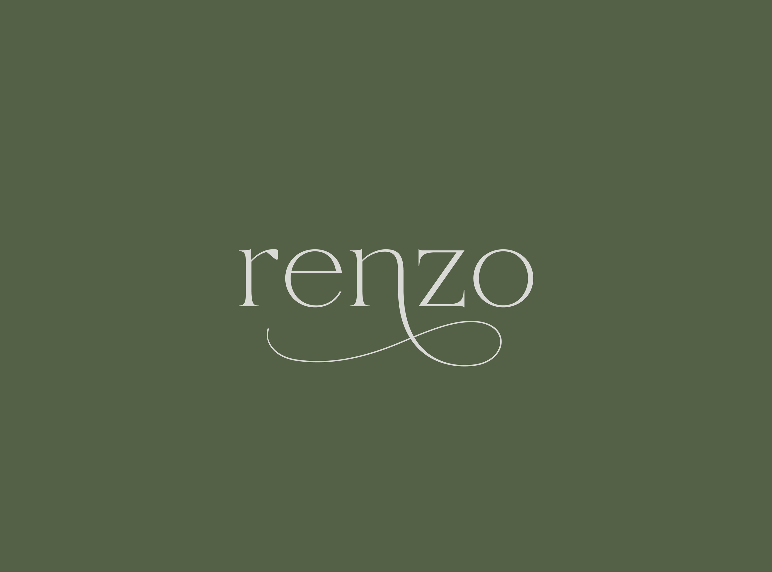
A deep green was chosen as the primary color to echo the lush greenery throughout the restaurant, with soft pink introduced as a secondary accent and a classic grey grounding the palette.

With the identity and color palette established, I completed the remaining collateral and menu design, extending the brand across all guest-facing touchpoints. Materials, layout, and typography were carefully considered to reflect Renzo’s relaxed sophistication, allowing the experience to feel cohesive from the moment guests sit down to the final course.
The result is a visual system that feels timeless yet approachable, supporting an all-day dining experience rooted in romance, ease, and a strong sense of place.