Midsweet House
Midsweet House is a coffee shop and brand built around mood, music, and the quiet rituals of everyday life. Inspired by Imogen Heap’s Hide and Seek and the lyric “mid-sweet talk, newspaper word cutouts,” the identity draws from found typography and imperfect composition, where individual letterforms feel collected rather than uniform and come together to create something warm and familiar.
The visual language balances expression with restraint. Typography plays a central role, using variation, texture, and subtle irregularity to give the brand personality without feeling overworked. Paired with a grounded supporting type system, the identity remains considered and approachable.
Midsweet House is imagined as a place for both quick stops and longer pauses, where music sets the tone and repetition brings comfort. The brand isn’t built around novelty or trends, but around creating a feeling that’s easy to recognize and return to.

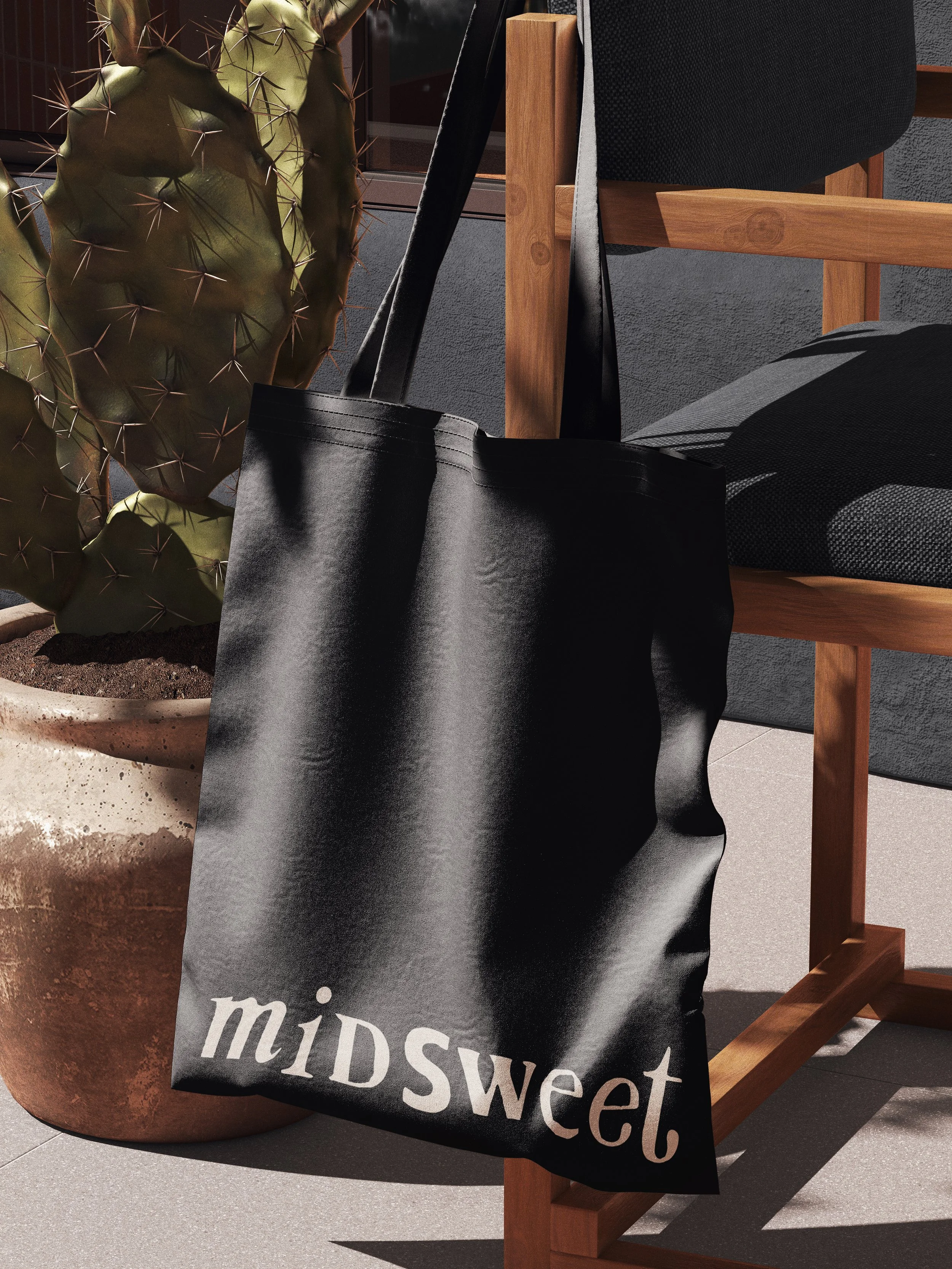
Brand Strategy, Art Direction, Logo Design, Visual Identity, Social Media, Digital Assets, Branded Merchandise
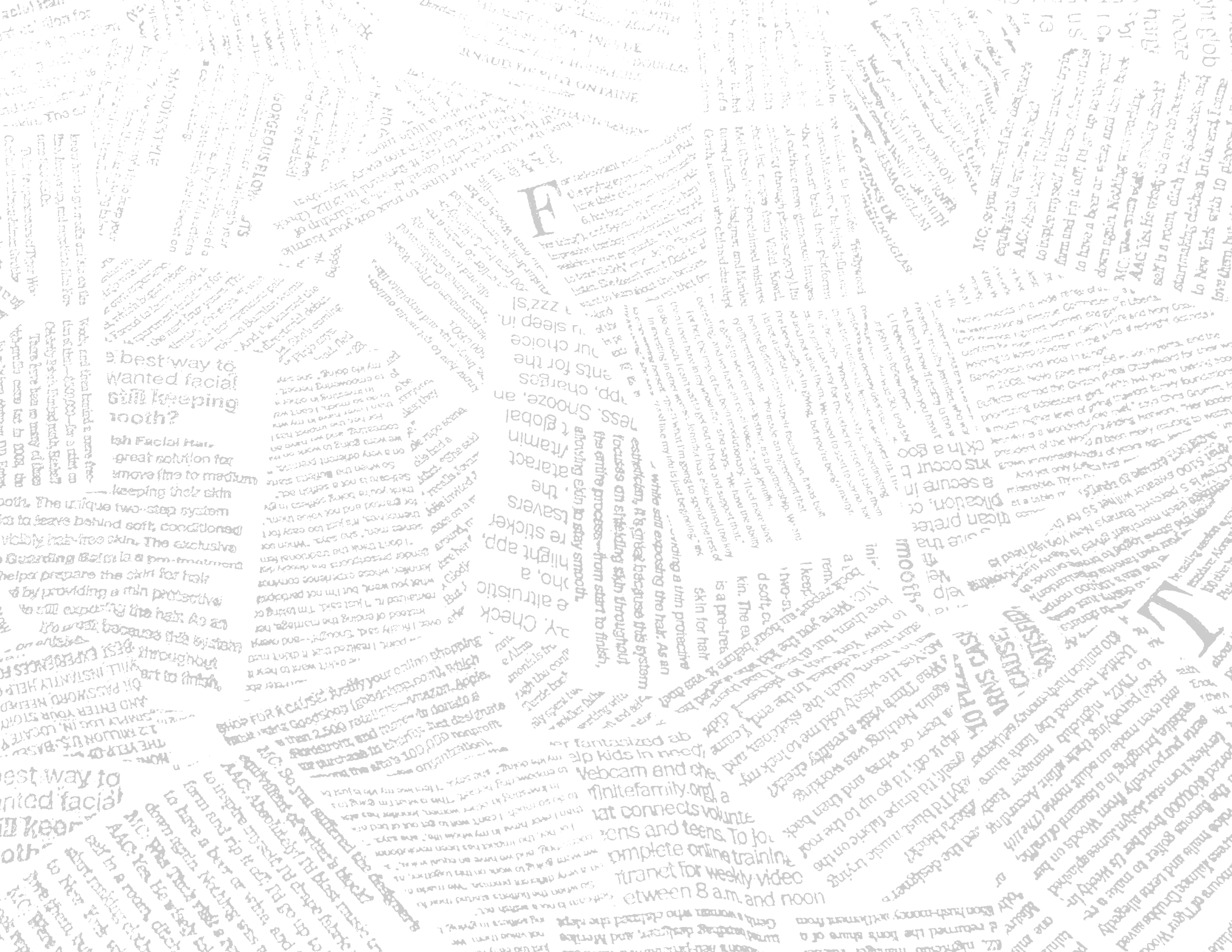
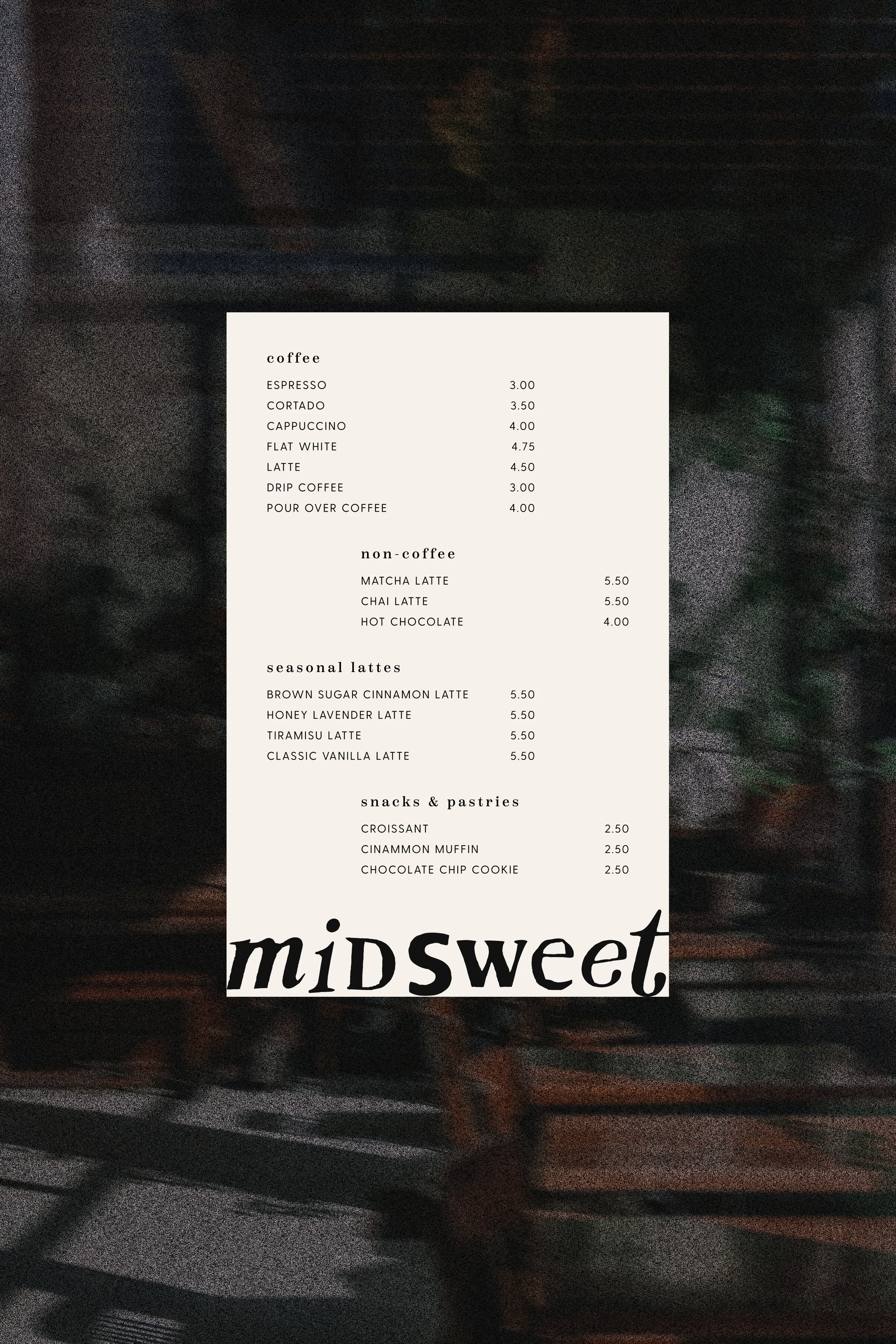
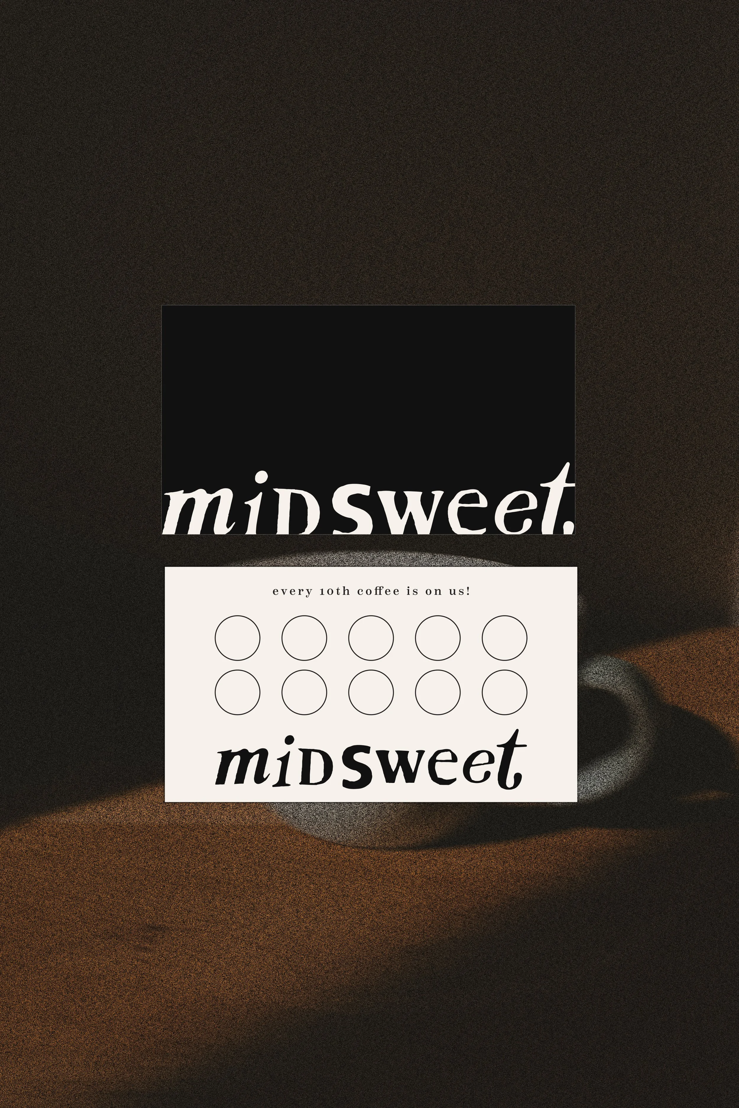
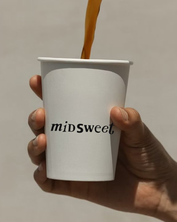
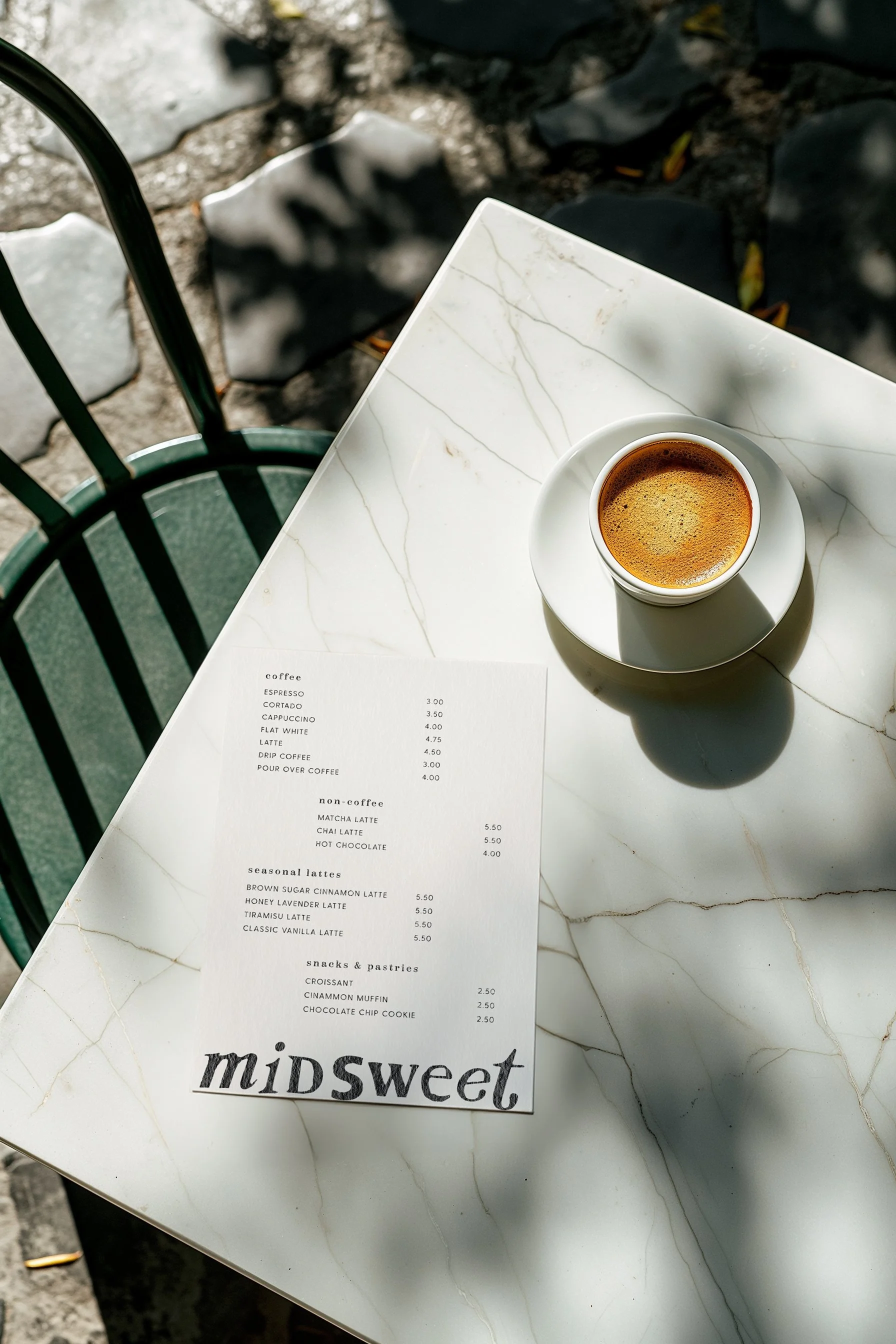
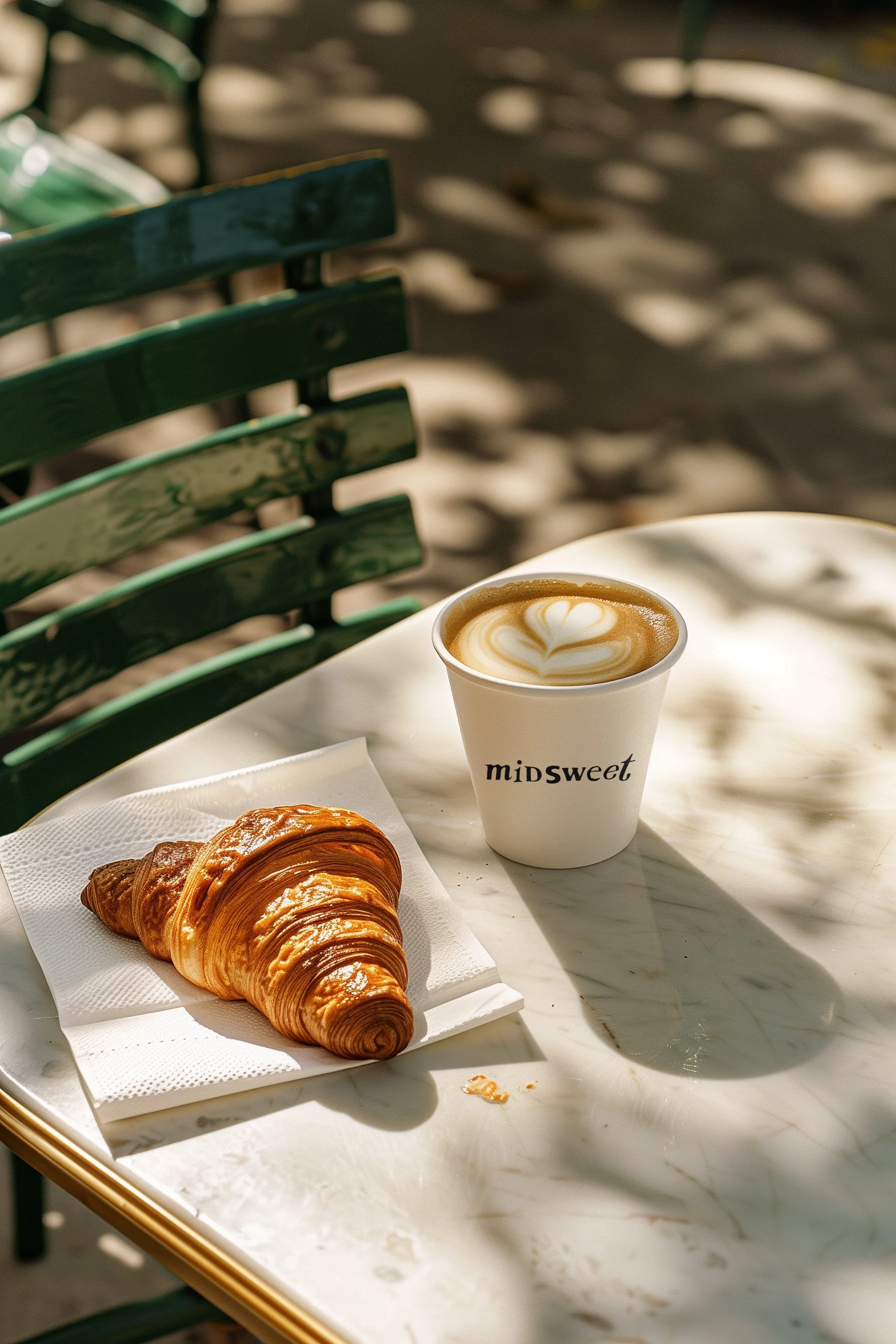
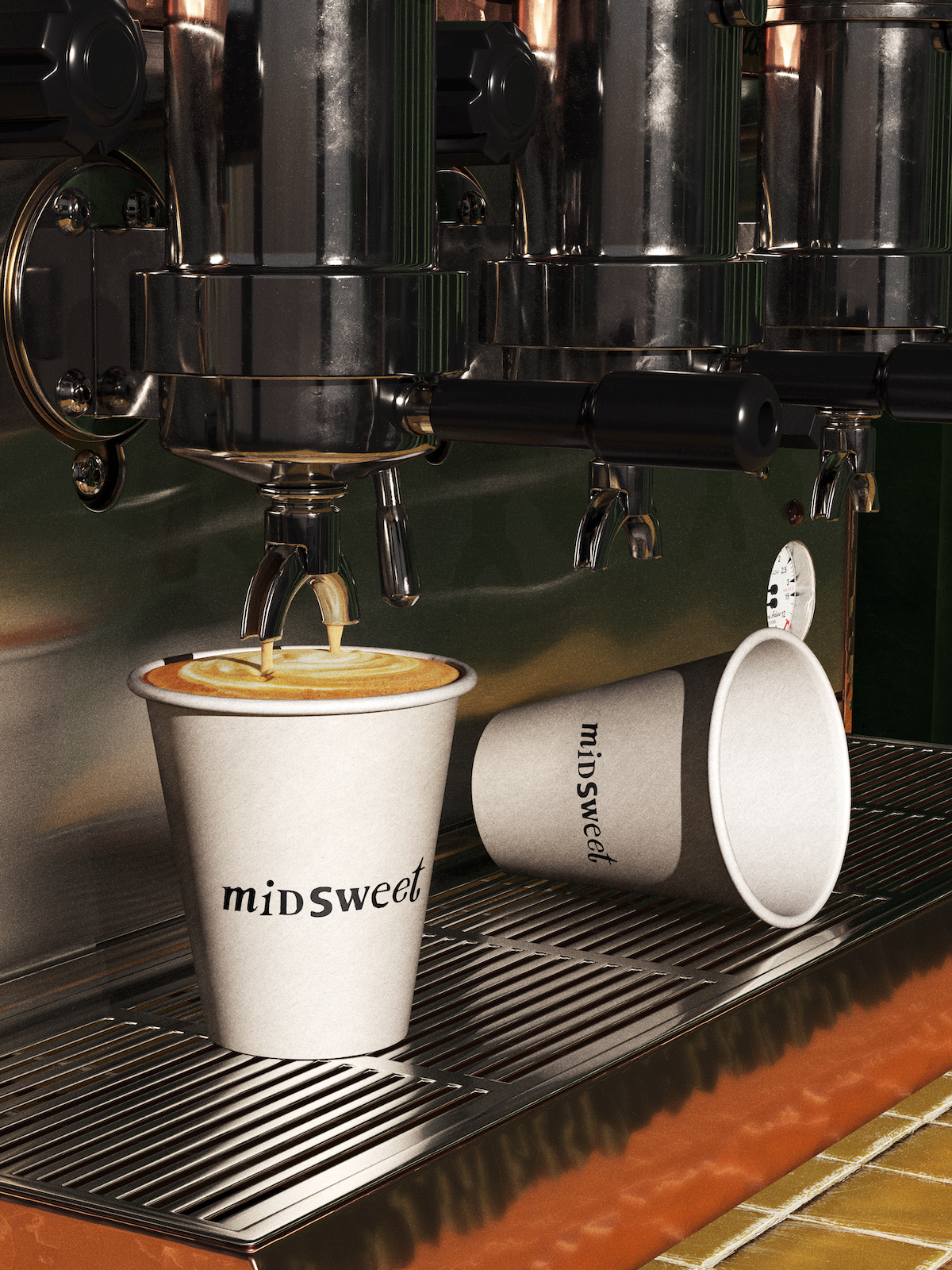
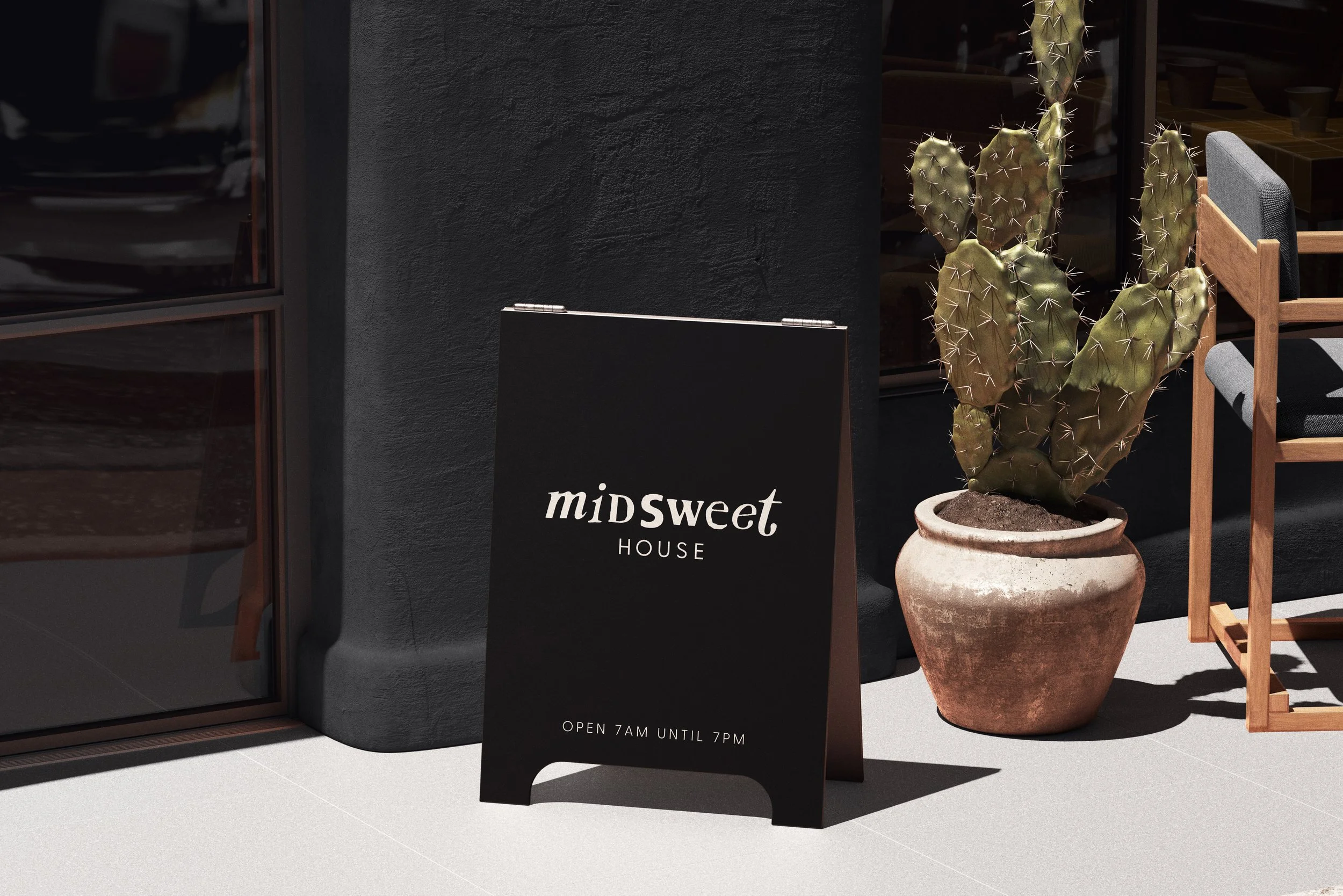
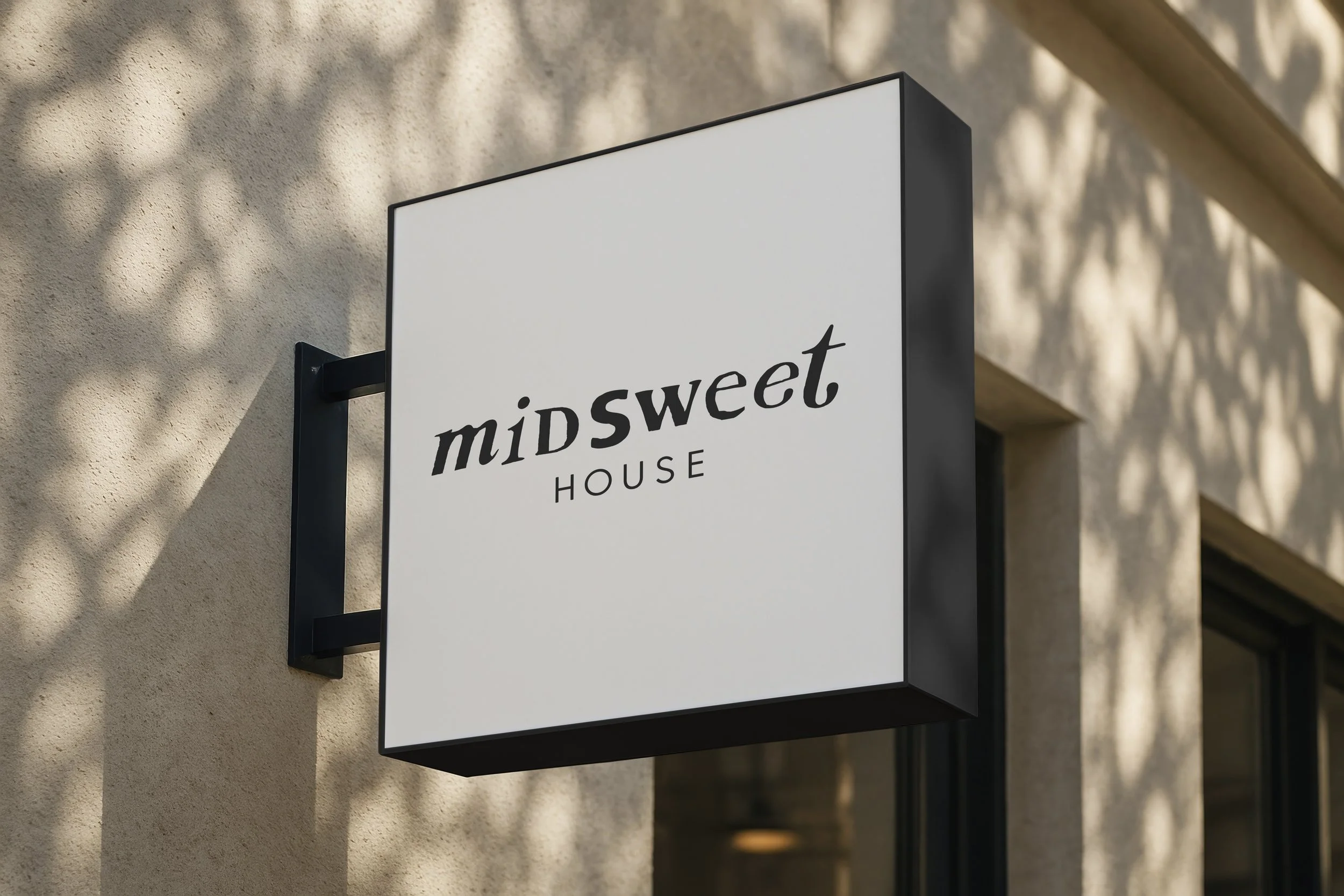
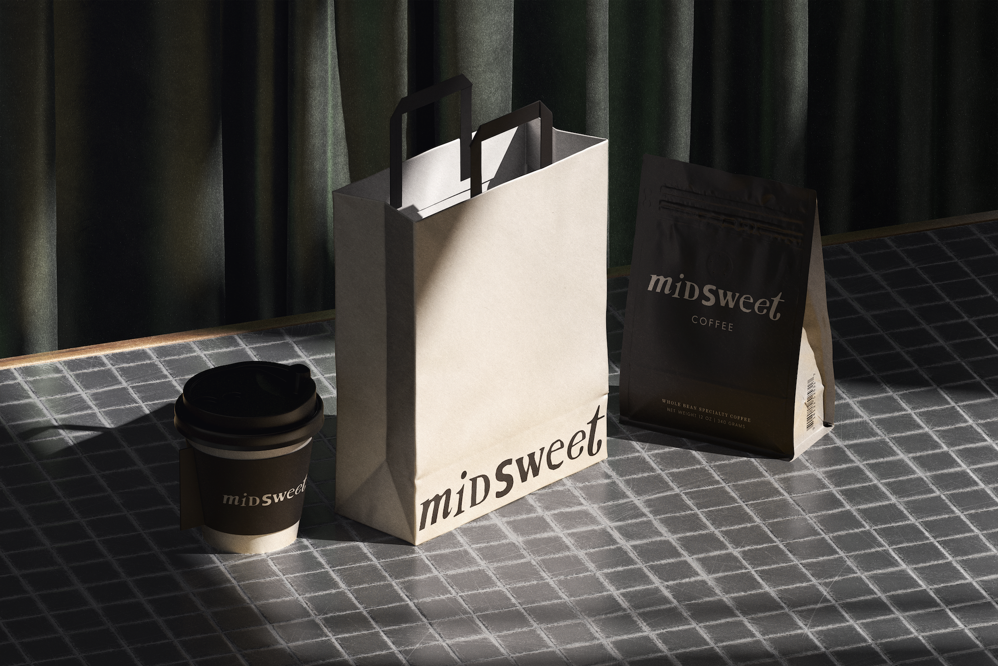
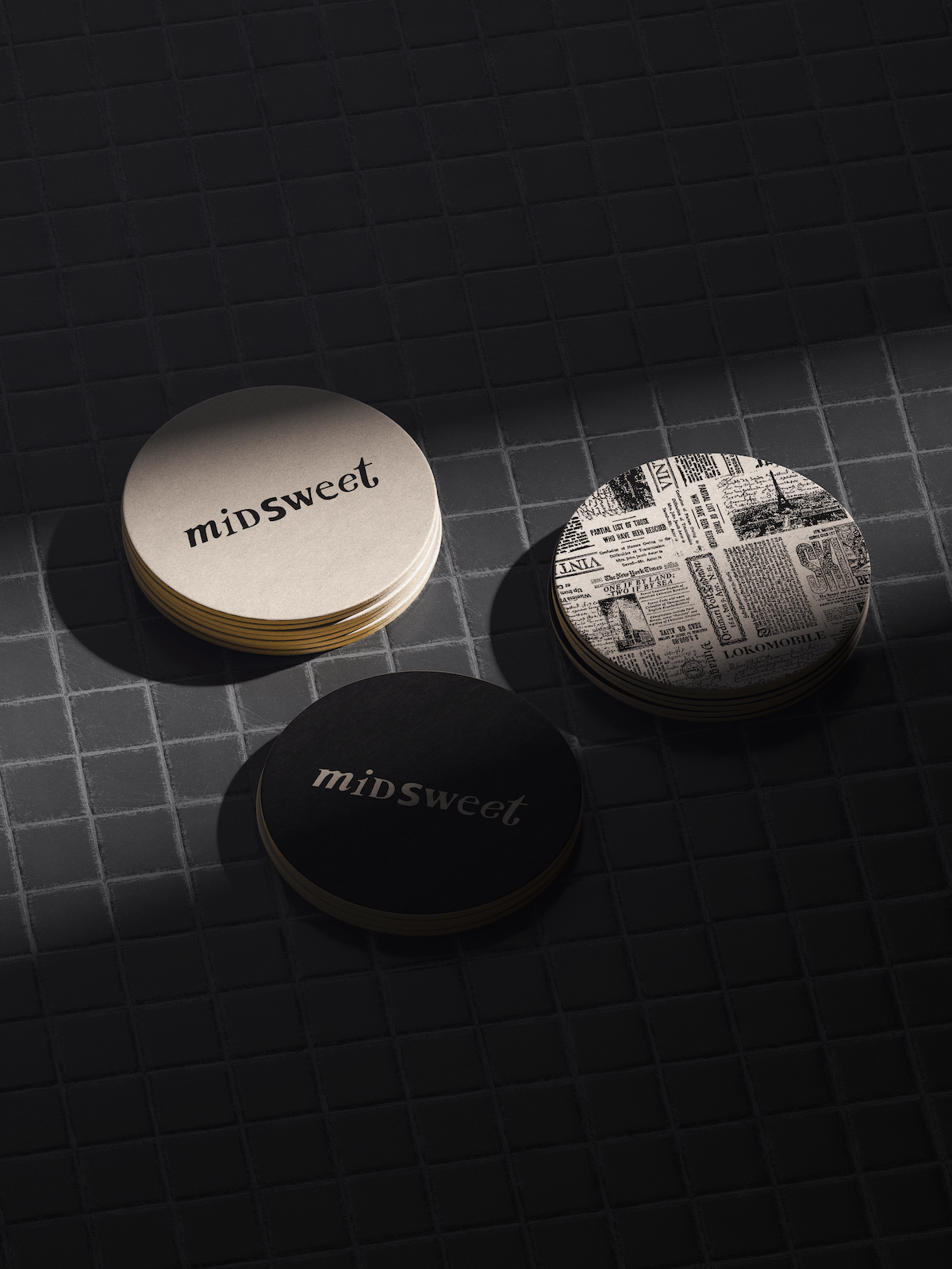
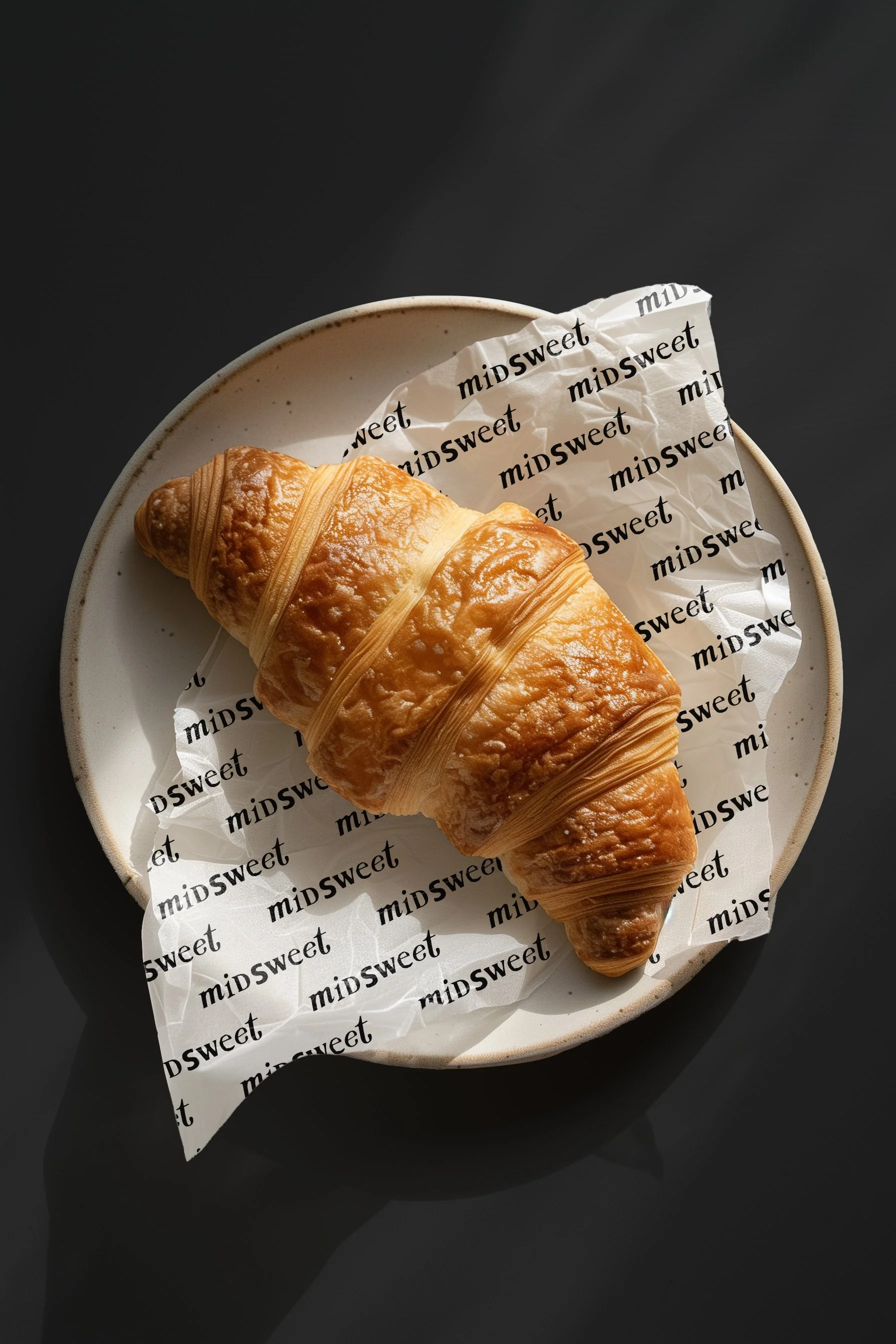
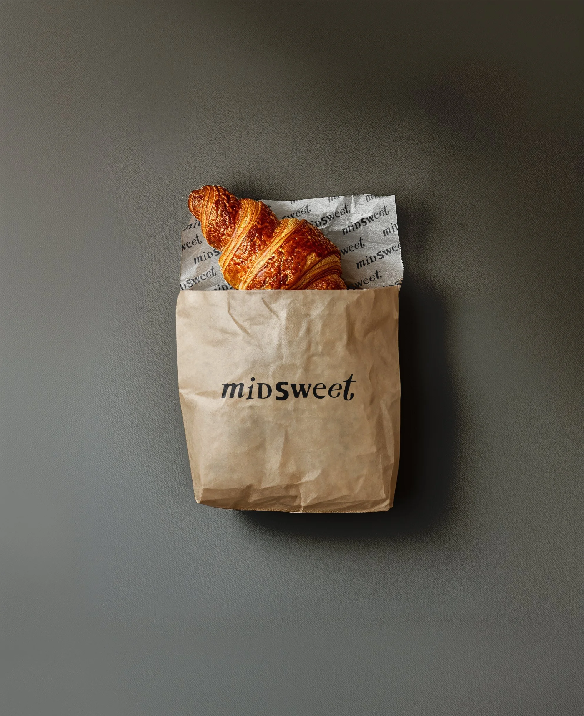
The logo was designed using a cut-and-paste approach, with each letter styled to feel as though it was clipped from a different newspaper source. This deliberate inconsistency gives the wordmark a human, analog quality, referencing zines, lyrics scribbled in margins, and the tactile nature of print. The contrast between the expressive serif logo and a restrained sans serif for “HOUSE” grounds the brand, balancing character with clarity.
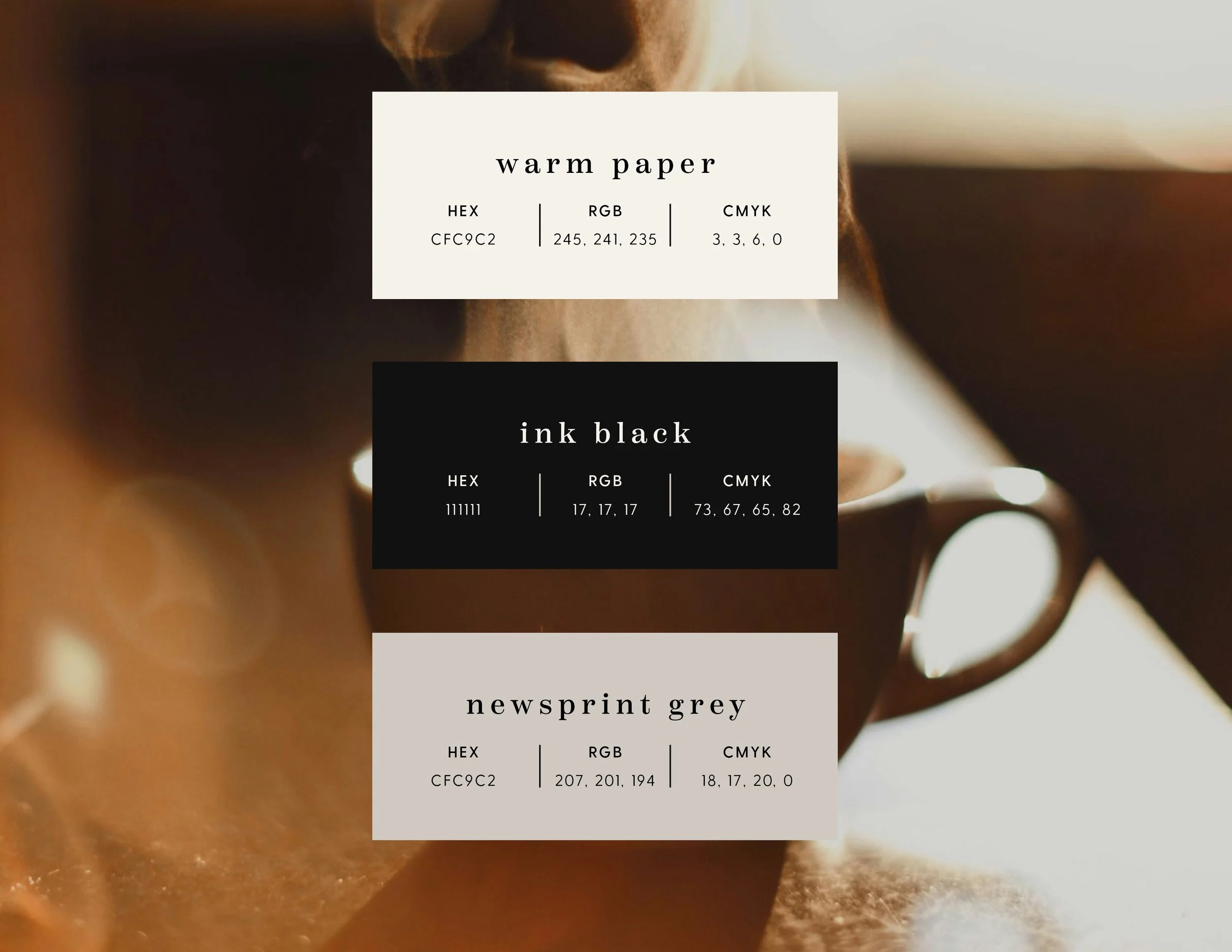
From there, the identity system was expanded across packaging, menus, signage, and digital touchpoints. A muted, editorial color palette inspired by warm paper, ink, and coffee tones reinforces the nostalgic, lo-fi sensibility, while photography and layouts emphasize softness, light, and moments of pause. Every application was designed to feel intentional but unfussy, creating a brand that invites people to linger rather than rush.