
This is a small, curated collection of brand identities and logo applications developed across beauty, fragrance, wellness, hospitality, and lifestyle. Each project explores how concept, tone, and visual language come together to form cohesive brand systems, with particular attention to typography, color, materiality, and how the work lives in the real world.
The focus is on restraint and intention rather than volume. These identities are designed to be used, extending across logos, packaging, print, and digital touchpoints, with systems built to feel consistent, flexible, and considered. While the aesthetics vary by project and industry, the work is connected by a shared approach to clarity, craft, and emotional resonance.
Together, this collection reflects an ongoing interest in building brands that feel thoughtful and expressive, with visual languages that support storytelling, experience, and longevity.
Identity Studies
Brand Strategy, Art Direction, Global Brand Systems, Visual Identity, Packaging, Print and Environmental Design, Cultural and Seasonal Campaigns
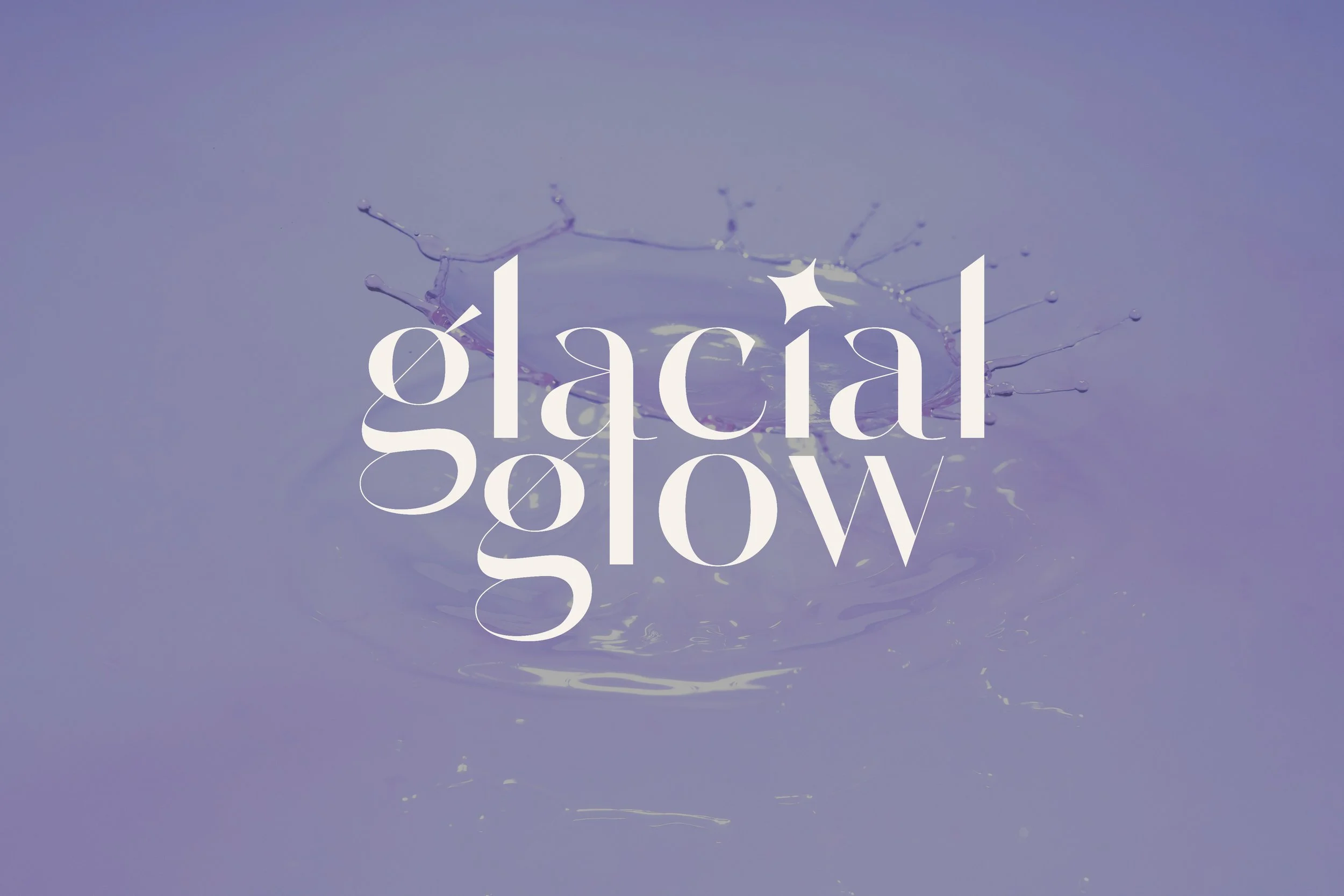
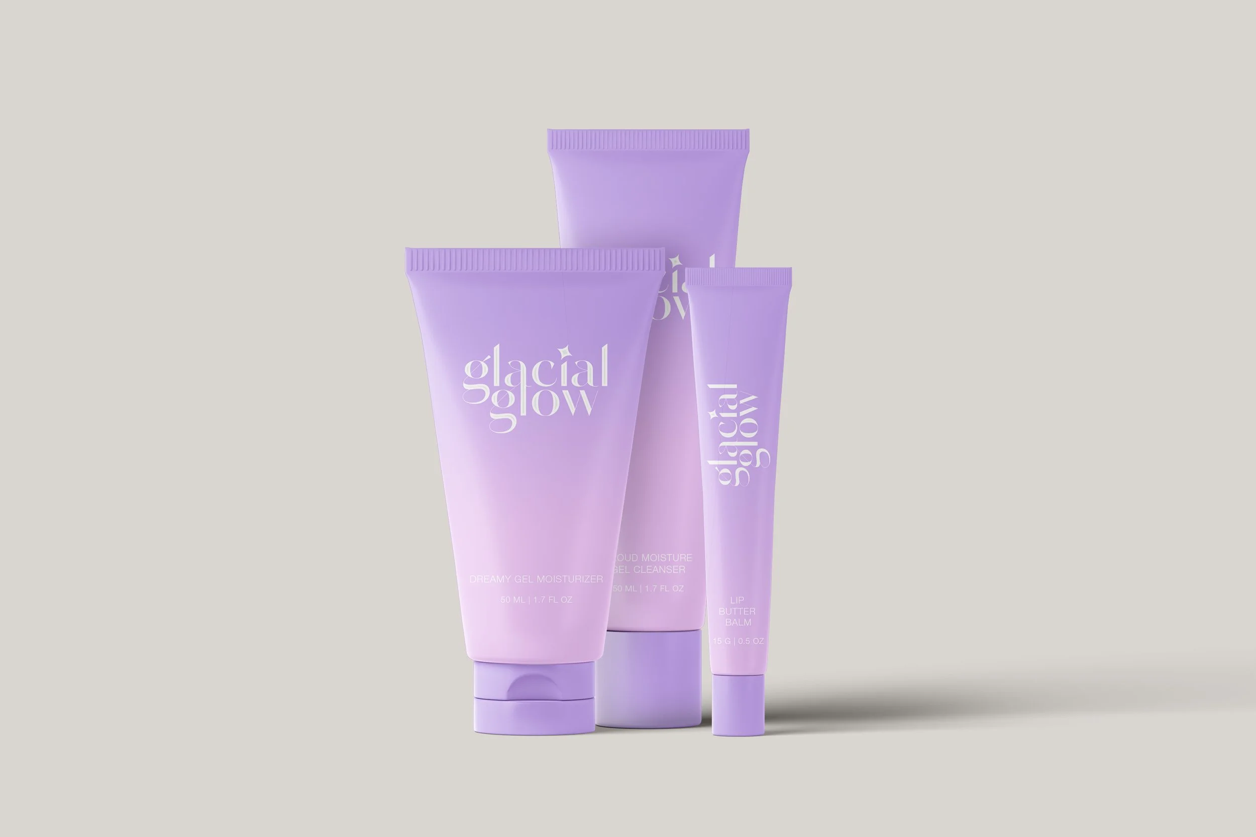
Glacial Glow
For Glacial Glow, I created a logo and visual identity rooted in softness, glow, and modern beauty. Fluid typography and icy pastel tones come together to express hydration, calm, and an effortlessly luminous brand world.
Client
Glacial Glow Skincare
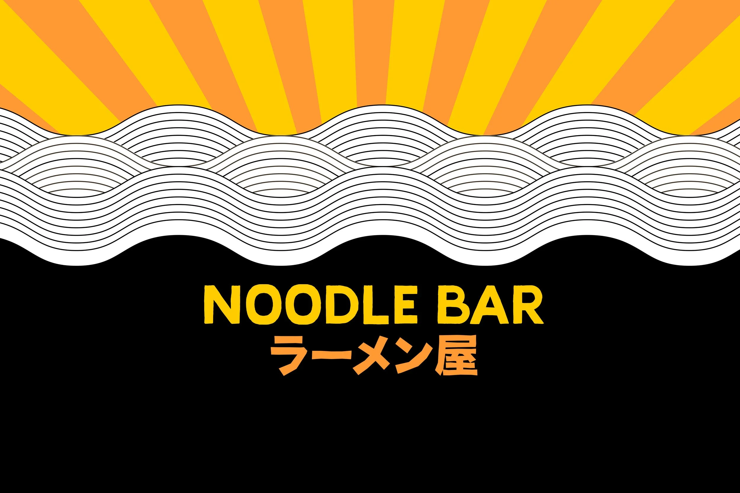
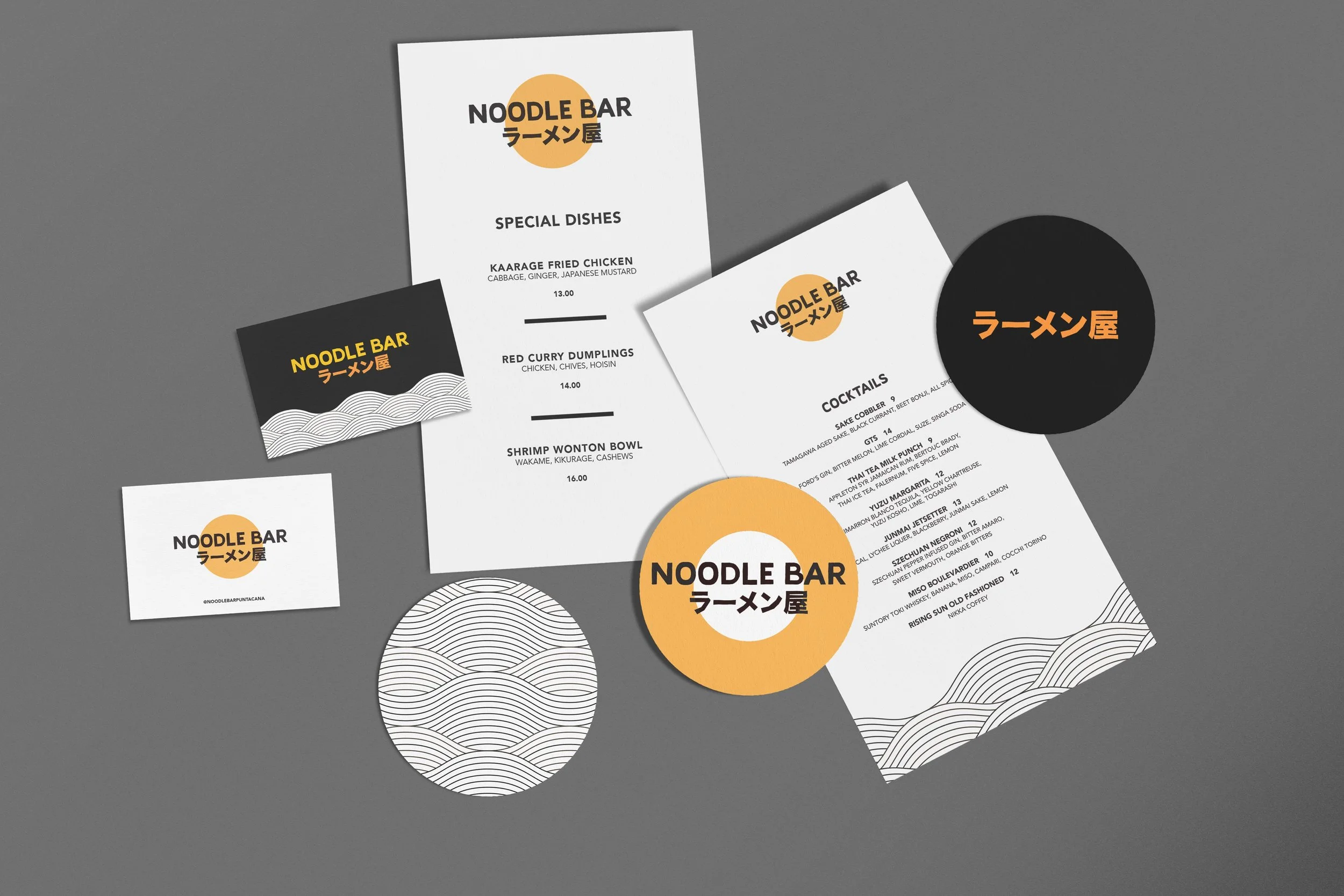
Noodle Bar
Noodle Bar is a vibrant dining concept created for the first all-inclusive W Hotels property in Punta Cana. The identity blends graphic simplicity with subtle nods to Japanese iconography, resulting in a system that feels fun, casual, and contemporary while remaining distinctly W.
Client
W Hotels
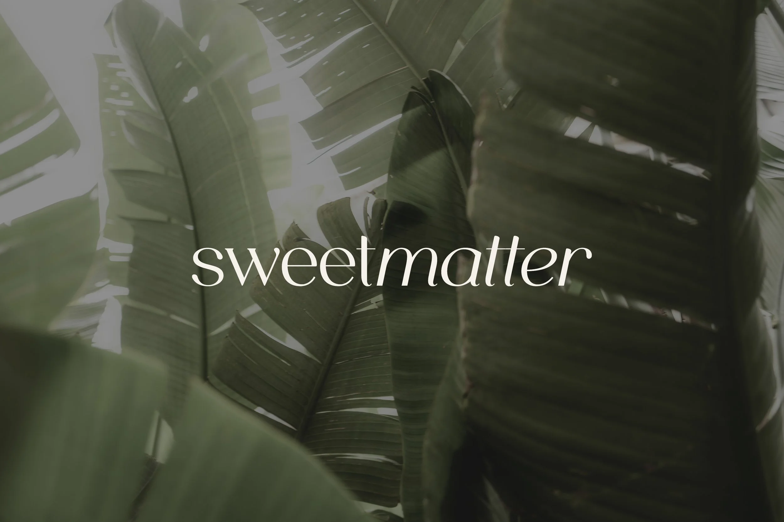
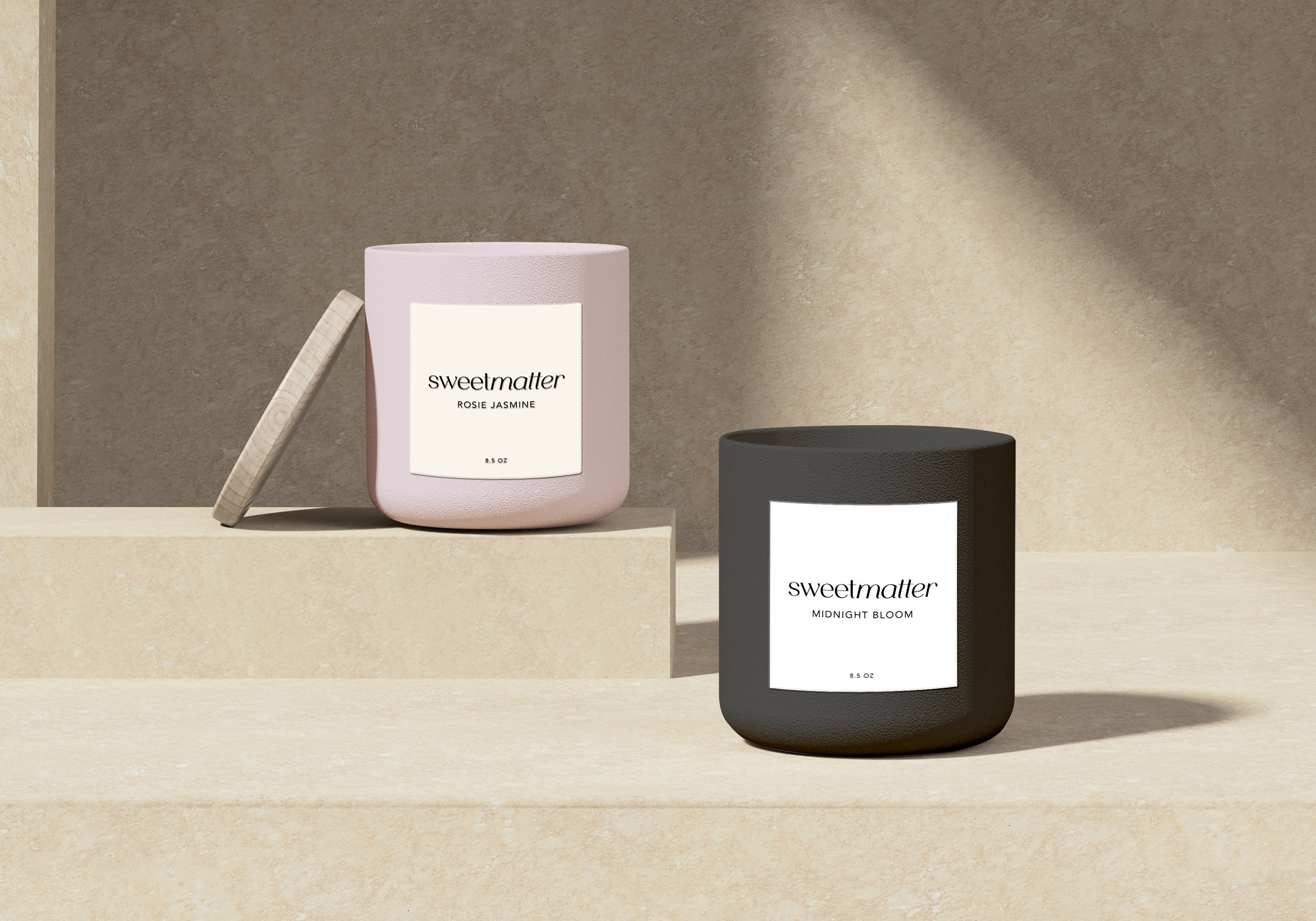
Sweetmatter
Sweetmatter is a modern candle brand centered on mood, ritual, and quiet indulgence. The identity pairs refined typography with warm, natural tones to create a calming, tactile presence across packaging and imagery.
Client
Sweetmatter Scents
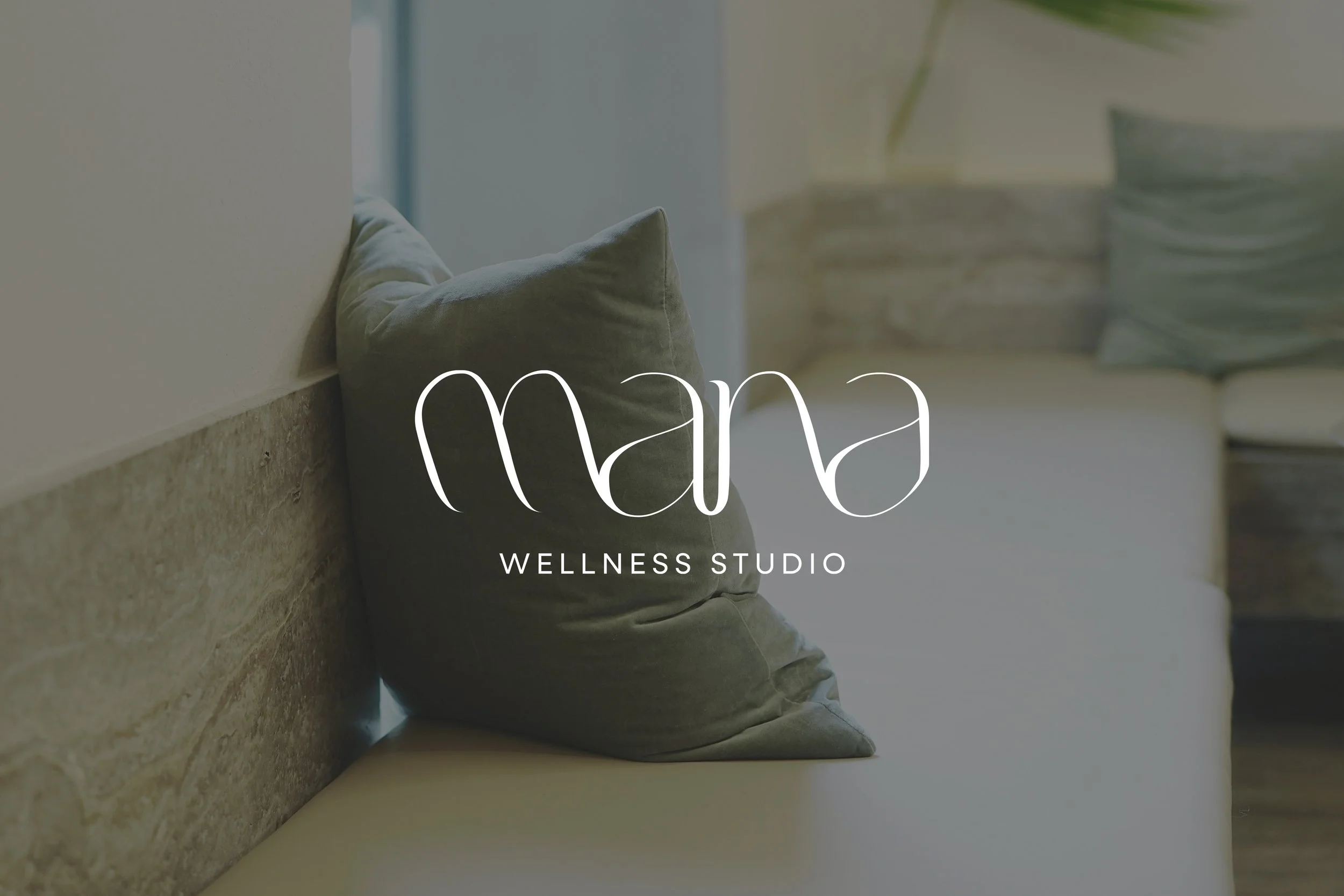
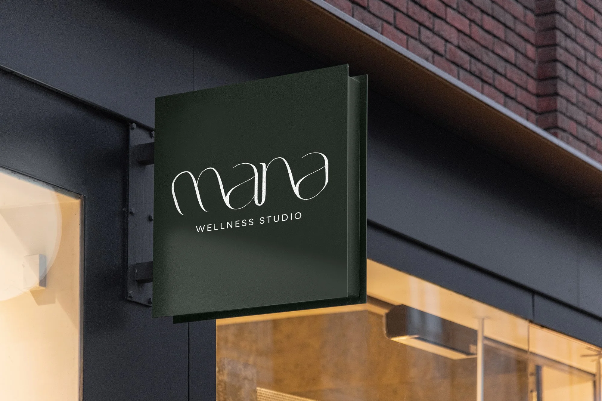
Mana Wellness Studio
Mana Wellness Studio is a holistic wellness brand rooted in balance, calm, and restoration. The identity uses fluid typography and a grounded, natural palette to create a sense of ease across physical and environmental applications.
Client
Mana Wellness Studio
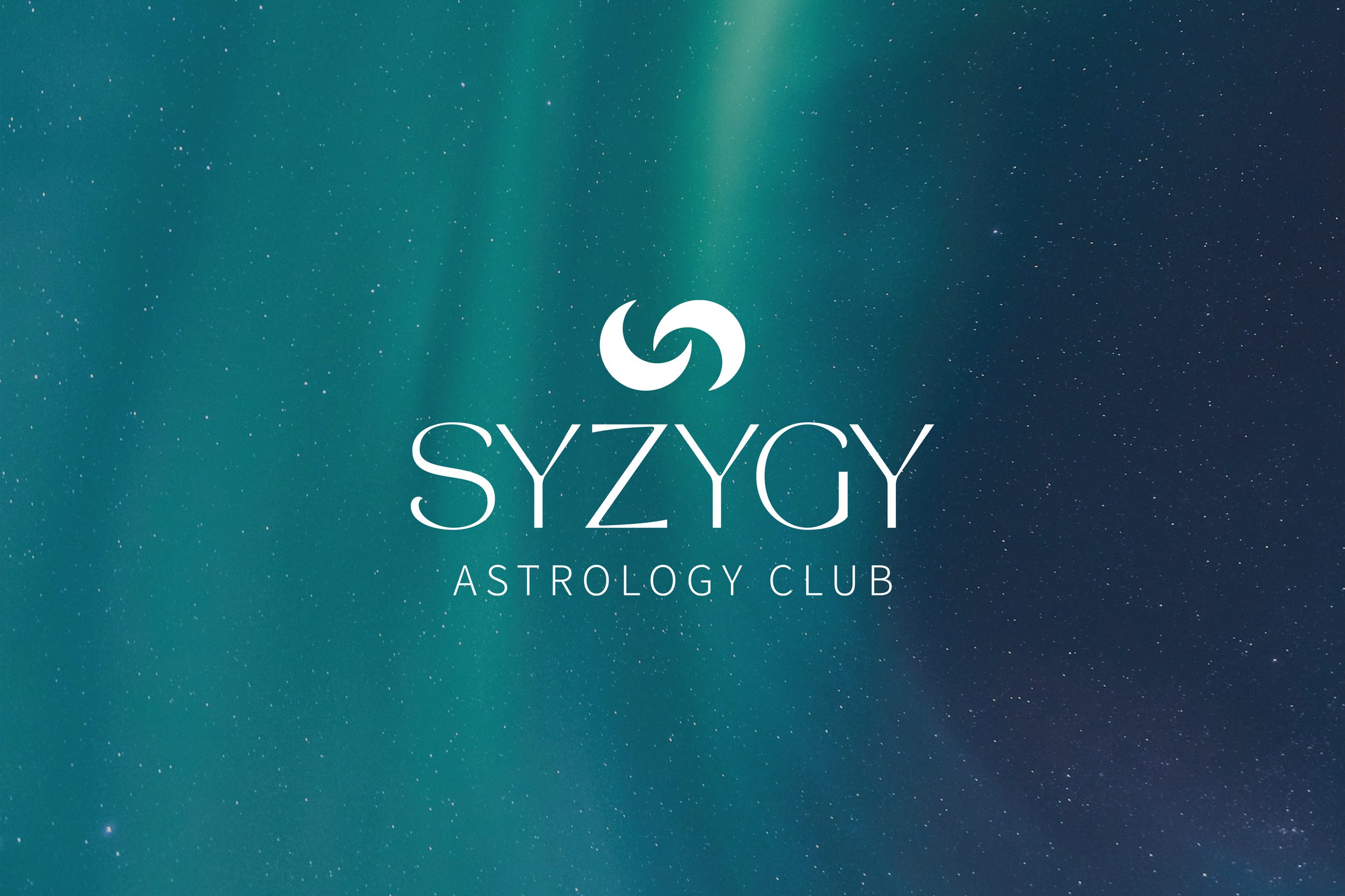
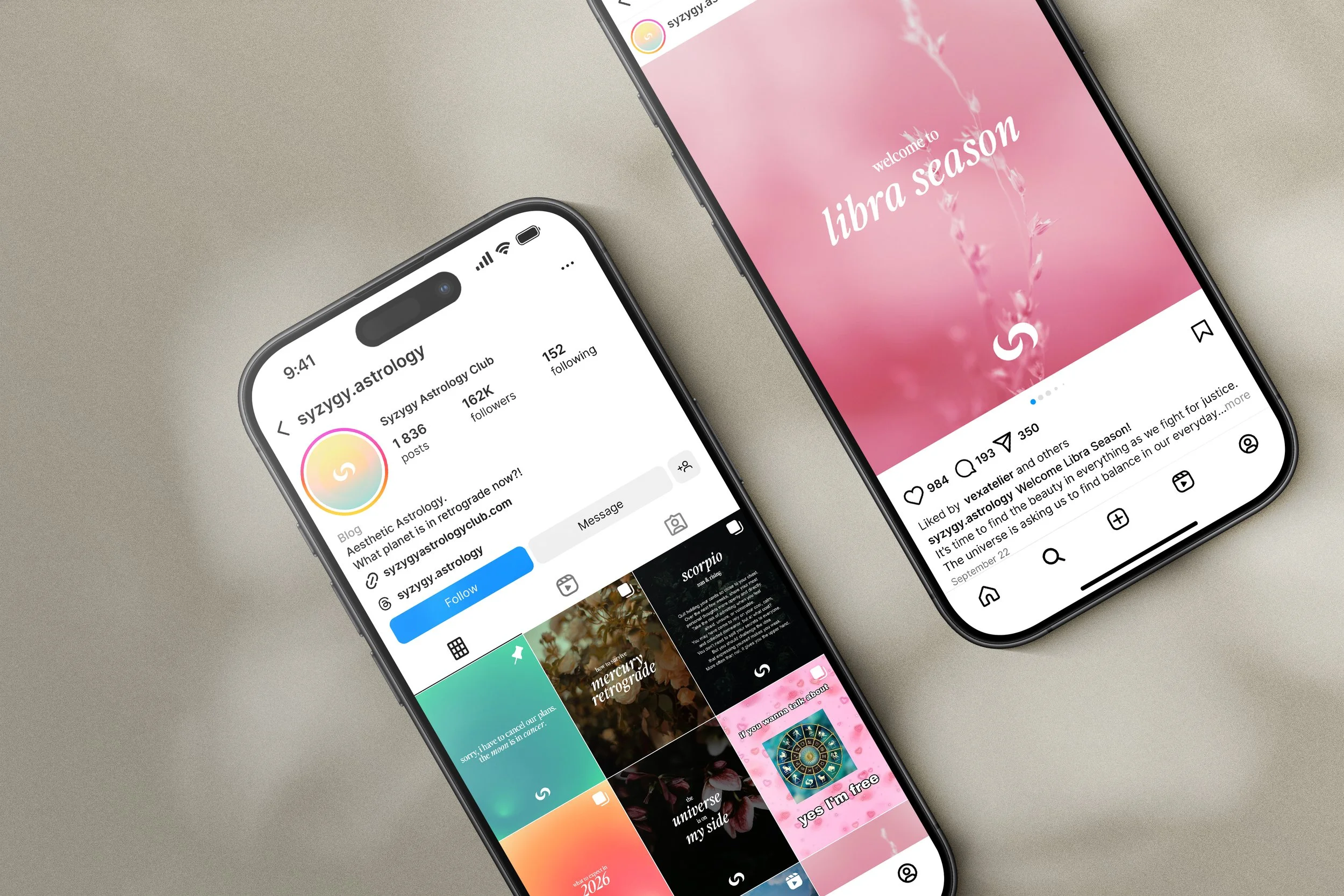
Syzygy Astrology Club
For Syzygy Astrology Club, I created a visual identity rooted in cosmic alignment and introspection. The logo mark, formed by two crescent moons in syzygy, represents the meeting of cycles, intuition, and self-awareness.
Client
Syzygy Astrology Club
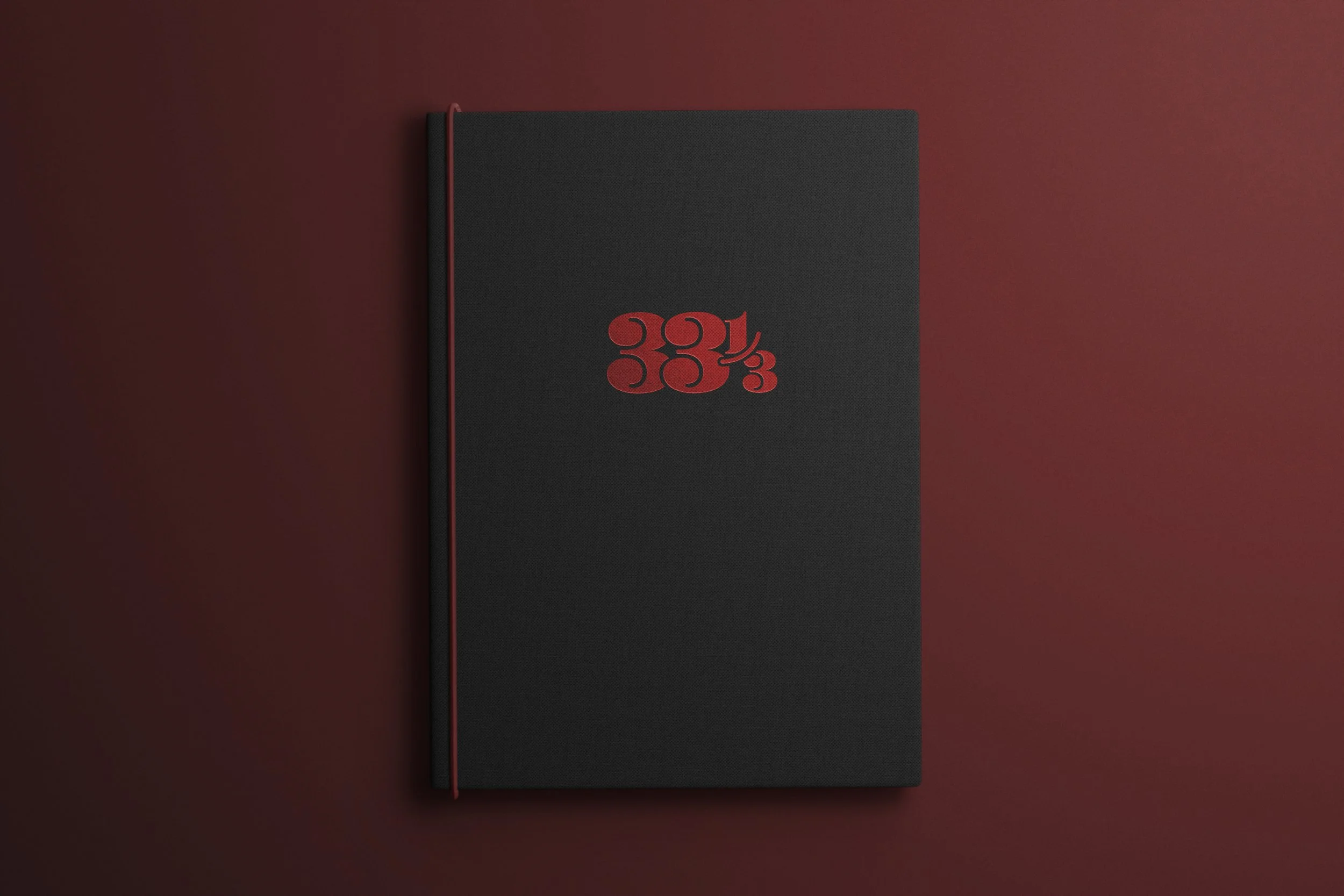
33 1/3 Speakeasy
33 ⅓ is a speakeasy at W Punta Cana inspired by the ritual of vinyl listening and the allure of hidden bars. The visual identity translates sound, texture, and atmosphere into a tactile system designed to support the experience of the space.
Client
W Hotels
Allen Notary Services
Allen Notary Services is a professional identity designed to convey trust, clarity, and credibility. The logo and supporting materials use refined typography and a restrained palette to create a polished, dependable presence across print applications.

Client
Allen Notary Services
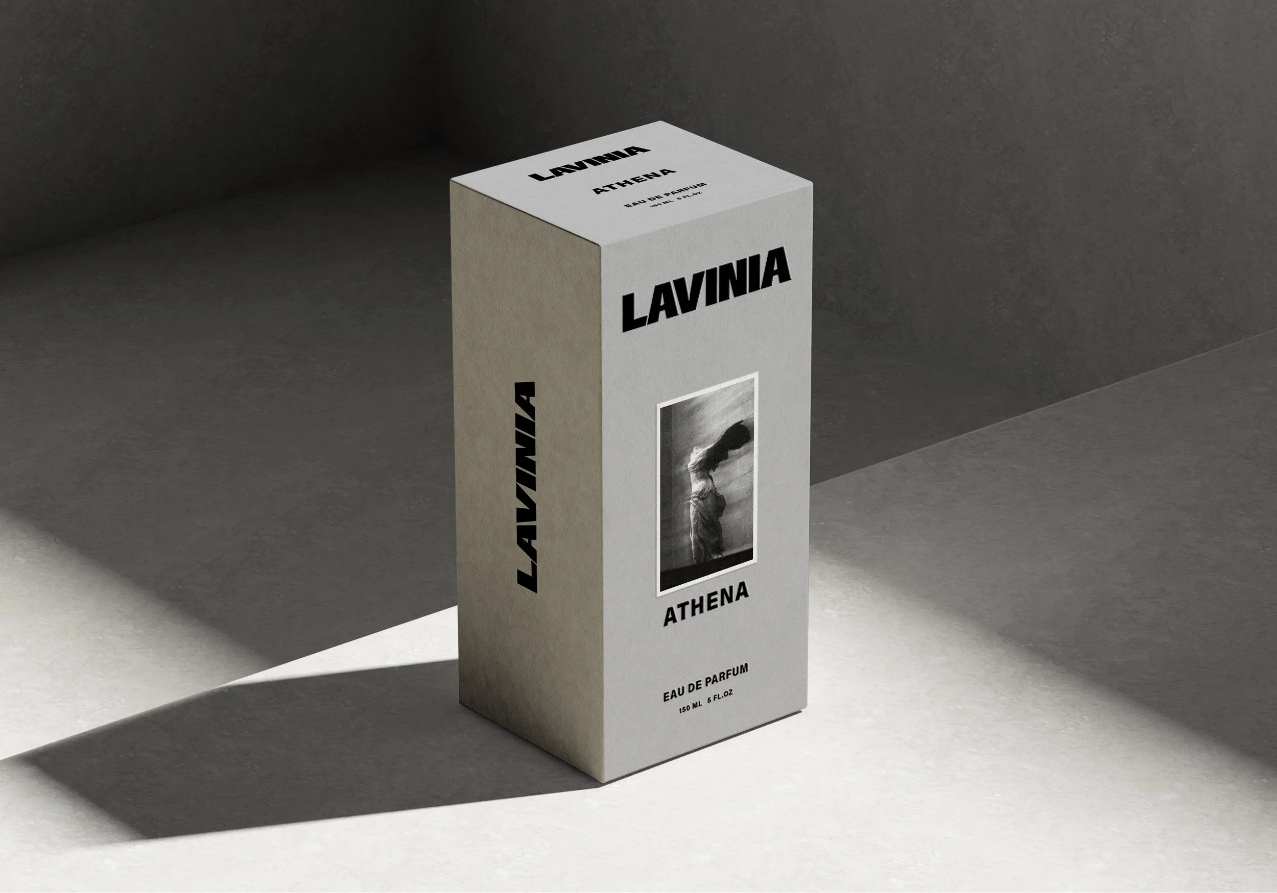
Lavinia Fragrances
For Lavinia Fragrances, I developed a visual identity that explores bold femininity through contrast and control. High-impact typography and minimal design language evoke strength, elegance, and modern luxury.
Client
Lavinia Fragrances