
Commissioned by EDITION, I created a series of bespoke beer labels developed exclusively for individual properties around the world. Each label was designed to reflect the character and energy of its location, while still feeling cohesive within the broader EDITION brand.
Working closely with local brewers and internal teams, I translated each beer’s story into a visual identity rooted in place. The work ranged from illustration-led concepts to more typographic approaches, with color, composition, and detail tailored to each property. Every label was designed with production in mind, balancing expression and restraint so the final result felt considered, tactile, and easy to live with.
Viewed together, the labels form a collection that is varied but consistent in tone. Rather than treating packaging as an afterthought, the project uses design to add meaning to a familiar object, creating a small but intentional brand moment within the guest experience.
Label Design
Brand Strategy, Art Direction, Visual Identity, Packaging Design, Illustration and Typography
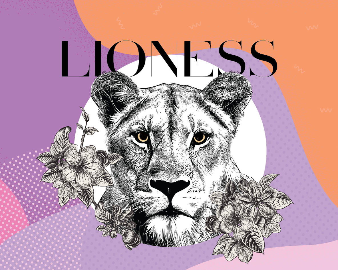
Lioness
I drew inspiration from the cultural symbolism of the lion in Singapore, using it as a representation of strength, pride, and quiet confidence. The detailed illustration is balanced with soft pastel layers and modern typography to reflect the city’s blend of heritage and contemporary culture.
Client
The Singapore EDITION
The label is shaped by the layered meaning of Tritone, pulling from Roman mythology, the trident, and the amphibious newt. These elements converge in an X-shaped composition, while a restrained three-color palette nods to the tritone in both music and print, creating contrast, rhythm, and a bold graphic presence.
Tritone
Client
The Rome EDITION
Nocturne
Built around New York as the city that never sleeps, the label uses the owl as a nocturnal symbol of watchfulness, intelligence, and after-dark energy. A grungy, high-contrast illustration and dark palette give the design a raw, slightly rebellious edge, capturing the city’s creative grit and late-night pulse.
Client
The New York EDITION
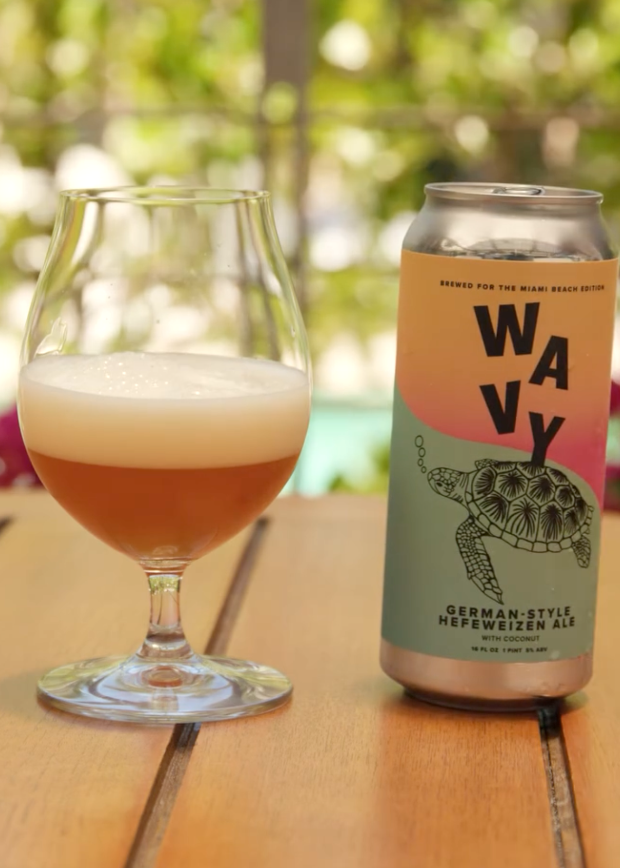
Wavy
Inspired by the rhythm of Miami Beach, the label features the sea turtle, a local symbol often seen along the shoreline near the hotel. Flowing color gradients and playful typography nod to ocean waves and the area’s sun-soaked, carefree energy, giving the label a light, relaxed feel that reflects its setting.
Client
The Miami Beach EDITION
Lovebird
The iconic New York pigeon is reimagined as a lovebird, turning a commonly overlooked city symbol into something playful and affectionate. A bold red palette and hand-drawn illustration bring warmth and humor to the label, celebrating the unexpected charm and resilience of Times Square.
Client
The Times Square EDITION
Al Maha
Built around Al Maha, the Arabic name for the Arabian oryx, the label draws on the animal’s symbolism of resilience, beauty, and its connection to the desert landscape of Abu Dhabi. A bold circular sun motif, refined geometry, and illustrative details balance tradition and modernity, grounding the IPA in a strong sense of place while keeping the design clean and contemporary.
Client
The Abu Dhabi EDITION
Paradise
Designed for Paradise Club at The Times Square EDITION, the champagne label draws from Art Deco references, Great Gatsby–era glamour, and classic French champagne cues. Bold geometry and contrast elevate the bottle, while a structured graphic framework keeps the Paradise Club logo clear and legible at the center of the design.
Client
The Times Square EDITION